Golden Grain Branding

Golden Grain Branding

Veg-Cafe Branding

Veg-Cafe Branding

Sri Devi Vilas Rebranding

Sri Devi Vilas Rebranding

Veni’s Sweets Branding

Veni’s Sweets Branding

Rojaa Mark Branding

Rojaa Mark Branding

Karich Murich Branding

Karich Murich Branding

VSS Candy Products Branding

VSS Candy Products Branding

Agent Clear Branding

Agent Clear Branding

Golden Grain Branding

Golden Grain, a brand offering a variety of noodle products, collaborated with Motiff Media to create a distinctive branding identity that would appeal to…

  • Strategy

    The branding strategy focused on a fresh, modern aesthetic while highlighting the quality of the ingredients used in Golden Grain noodles. The design incorporated vibrant colors for each noodle flavor, ensuring the packaging is not only appealing but also easily identifiable. The clean and simple logo reinforces the idea of quality and freshness.

  • Design

    The logo design for Golden Grain is clean, modern, and minimalistic, using bold typography paired with a simple leaf icon to symbolize freshness and natural ingredients. The packaging design incorporates rich, vibrant colors that correspond to each noodle flavor, with imagery that emphasizes the product’s quality and delicious taste. The layout is easy to read, with clear labeling and product information to enhance customer trust and recognition.

  • Client

    Golden Grain

  • Outcome

    The branding successfully captures the essence of Golden Grain, helping the brand stand out on retail shelves. The vibrant packaging and modern logo design have enhanced consumer engagement, contributing to stronger brand recognition and market presence.

  • Tags

    BrandDesign, BrandGuidelines, BrandingInspiration, BrandStrategy, BusinessBranding, CreativeBranding, CustomBranding, DigitalBranding, FMCGbranding, LogoDesign, Merchandising, MinimalBrandDesign, MockupDesign, ModernBranding, PackagingDesign, Retail Branding, VisualIdentity

View Project

Veg-Cafe Branding

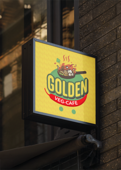
Golden Veg-Cafe, a vibrant vegetarian eatery, sought a fresh and dynamic branding design to reflect their delicious, healthy offerings. They partnered with Motiff Media…

  • Strategy

    The strategy centered around a fun and engaging design that captures the essence of vegetarian cuisine—fresh, healthy, and flavorful. The branding focused on bold, vibrant colors like yellow and green, symbolizing energy, freshness, and nature. The logo incorporates a playful, lively design that communicates the warmth and inviting atmosphere of the cafe.

  • Design

    The logo features a playful and colorful design, with the word "Golden" in bold lettering and a vegetable-filled wok to represent the cafe's focus on fresh, healthy vegetarian food. The use of bright yellow and green tones adds vibrancy, while the modern font ensures the brand looks fresh and contemporary. The branding extended to various touchpoints, including storefront signage, aprons, and promotional materials, ensuring consistent visibility and recognition.

  • Client

    Golden Veg-Cafe

  • Outcome

    The rebranding successfully captured the lively and fresh identity of Golden Veg-Cafe. The new logo and cohesive branding materials have helped the cafe attract a broader audience and enhance its presence in the competitive food service industry.

  • Tags

    BrandDesign, BrandGuidelines, BrandingInspiration, BrandStrategy, BusinessBranding, CreativeBranding, CustomBranding, DigitalBranding, F&BBranding, Food Service Branding, LogoDesign, MinimalBrandDesign, MockupDesign, ModernBranding, PackagingDesign, RestaurantBranding, VisualIdentity

View Project

Sri Devi Vilas Rebranding

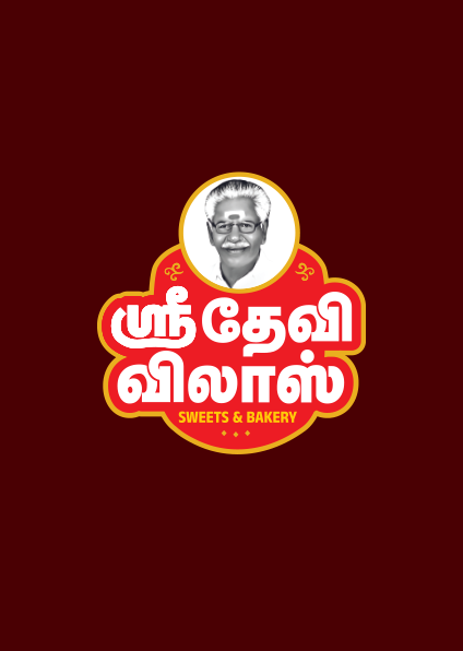
Sri Devi Vilas, a renowned name in the snack industry, sought Motiff Media’s expertise to refresh their brand identity. The goal was to modernize…

  • Strategy

    The strategy was to create a logo that combines tradition with a modern touch. The rebranding process involved refining the old logo to make it more dynamic, incorporating bold colors, and using a contemporary font. The packaging redesign focused on clarity, with bright colors that would stand out on the shelf and communicate the freshness and quality of the products.

  • Design

    The new logo features a cleaner, more contemporary design, with a focus on bold typography and a simplified emblem. The color palette was updated to enhance visibility and appeal, with a focus on vibrant colors that evoke freshness. The packaging for the various snack products now features a more consistent and recognizable layout, making the brand easy to identify across different product variants. The use of clean lines and modern fonts ensures the design feels fresh, while still paying homage to the brand’s roots.

  • Client

    Sri Devi Vilas

  • Outcome

    The rebranding successfully revitalized Sri Devi Vilas’s visual identity, with the new logo and packaging receiving positive feedback. The updated designs have helped the brand establish a more modern and cohesive presence, ensuring greater recognition on shelves and a stronger connection with both existing and new customers.

  • Tags

    BrandDesign, BrandGuidelines, BrandingInspiration, BrandStrategy, BusinessBranding, CreativeBranding, CustomBranding, DigitalBranding, F&BBranding

View Project

Veni’s Sweets Branding

Veni’s Sweets, a brand known for its fresh and delightful sweets, collaborated with Motiff Media to develop a unique and modern brand identity. The…

  • Strategy

    The strategy focused on combining fresh, and approachable elements with a clean and professional design. The logo was created using a circular shape with a vibrant yellow and green color scheme, symbolizing the freshness of the sweets. The use of a modern font and the inclusion of a leaf icon further reinforce the brand’s emphasis on freshness and quality.

  • Design

    The logo features a bold "V" combined with a leaf element inside a yellow circle, symbolizing freshness and sustainability. The typography for "Veni’s" is simple yet elegant, providing a contrast to the boldness of the icon. The color palette of green and yellow brings vibrancy and energy to the design. The branding was extended to merchandise, including polo shirts and hats, ensuring that the brand’s identity is visible and consistent across various platforms.

  • Client

    Veni's Sweets

  • Outcome

    The new branding has successfully conveyed the fresh and high-quality nature of Veni’s Sweets. The logo and merchandise designs have helped the brand gain a stronger market presence and are expected to create a more memorable experience for customers.

  • Tags

    BrandDesign, BrandGuidelines, BrandingInspiration, BrandStrategy, BusinessBranding, CreativeBranding, CustomBranding, DigitalBranding, F&BBranding, LogoDesign, MinimalBrandDesign, MockupDesign, ModernBranding, PackagingDesign, VisualIdentity

View Project

Rojaa Mark Branding

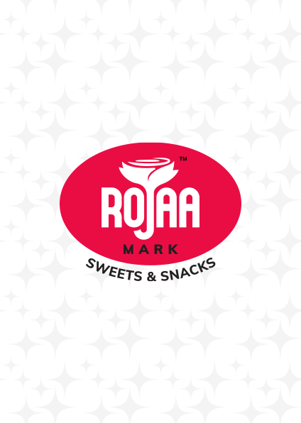
Rojaa Mark, a brand specializing in sweets and snacks, approached Motiff Media to create a simple yet impactful brand identity. The goal was to…

View Project

Karich Murich Branding

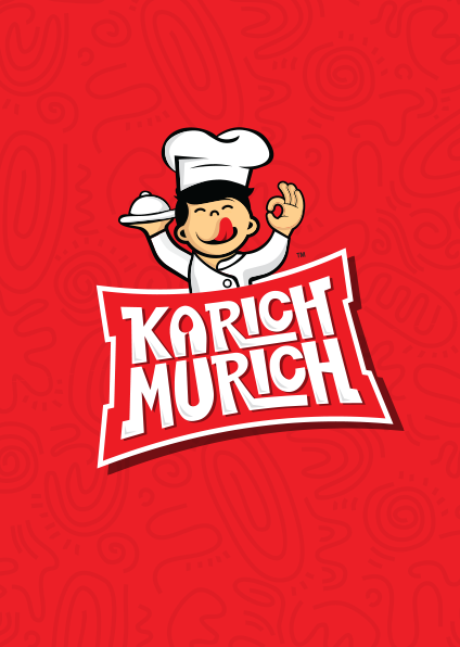
Karich Murich, a brand focused on delivering traditional and flavorful snacks, approached Motiff Media to create a distinctive brand identity. The goal was to…

View Project

VSS Candy Products Branding

VSS Candy Products, a prominent name in the sweets industry, approached Motiff Media for a comprehensive branding overhaul. The goal was to create a…

View Project

Agent Clear Branding

Agent Clear is a household cleaning brand that sought to develop a fresh, approachable visual identity for their range of cleaning products. The goal…

View Project