Veni’s Sweets Branding

Veni’s Sweets, a brand known for its fresh and delightful sweets, collaborated with Motiff Media to develop a unique and modern brand identity. The goal was to create a fresh, recognizable logo and a complete visual identity that communicates the brand’s commitment to quality and customer satisfaction.
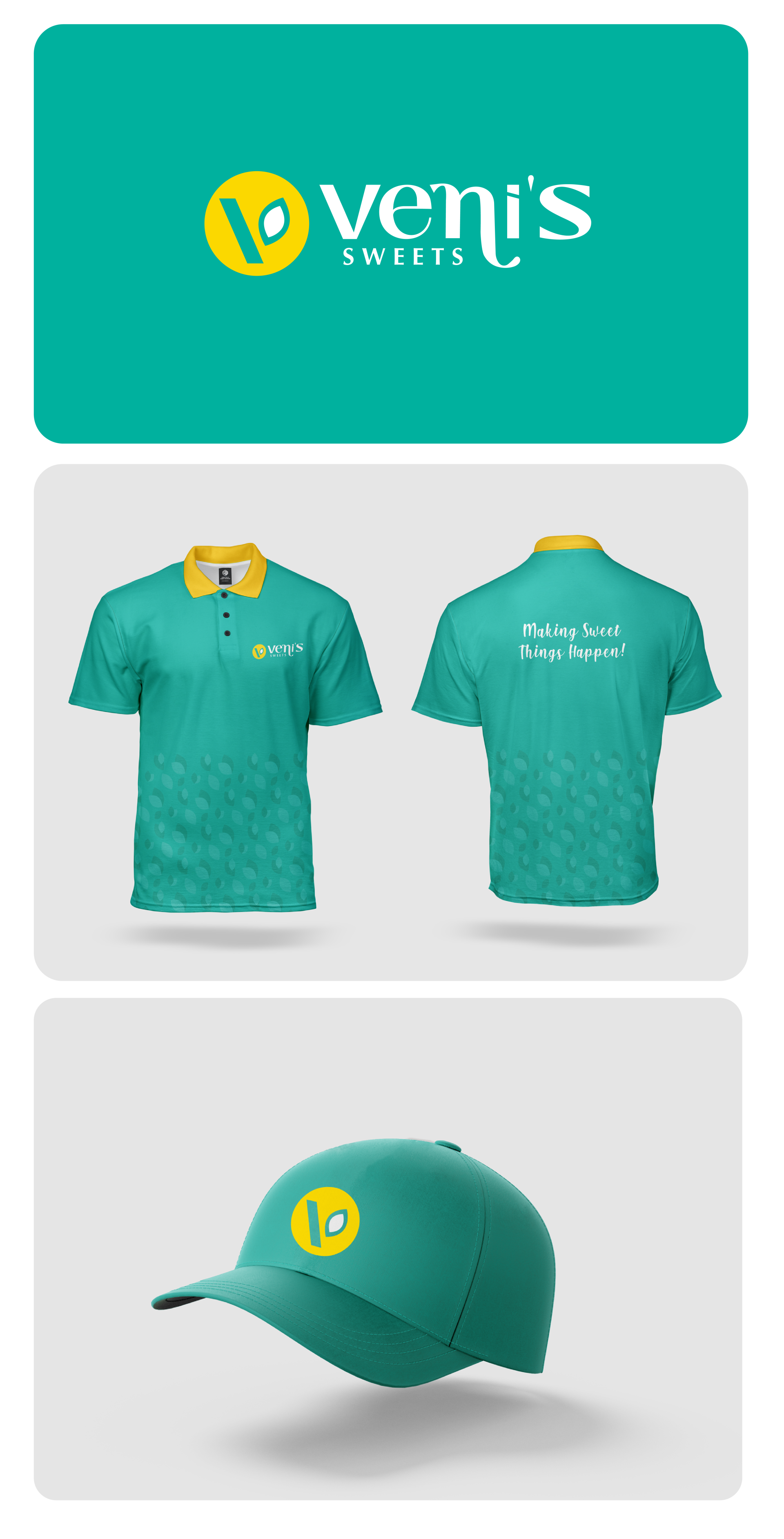
Task

The task was to design a simple yet vibrant logo along with merchandise designs (like polo shirts and hats) that reflect the sweet, fresh nature of the brand while ensuring it stands out in the sweets market.

Strategy

The strategy focused on combining fresh, and approachable elements with a clean and professional design. The logo was created using a circular shape with a vibrant yellow and green color scheme, symbolizing the freshness of the sweets. The use of a modern font and the inclusion of a leaf icon further reinforce the brand’s emphasis on freshness and quality.

Design

The logo features a bold "V" combined with a leaf element inside a yellow circle, symbolizing freshness and sustainability. The typography for "Veni’s" is simple yet elegant, providing a contrast to the boldness of the icon. The color palette of green and yellow brings vibrancy and energy to the design. The branding was extended to merchandise, including polo shirts and hats, ensuring that the brand’s identity is visible and consistent across various platforms.

Outcome

The new branding has successfully conveyed the fresh and high-quality nature of Veni’s Sweets. The logo and merchandise designs have helped the brand gain a stronger market presence and are expected to create a more memorable experience for customers.

Client

Veni's Sweets

Back

Leave a Reply

Your email address will not be published. Required fields are marked *