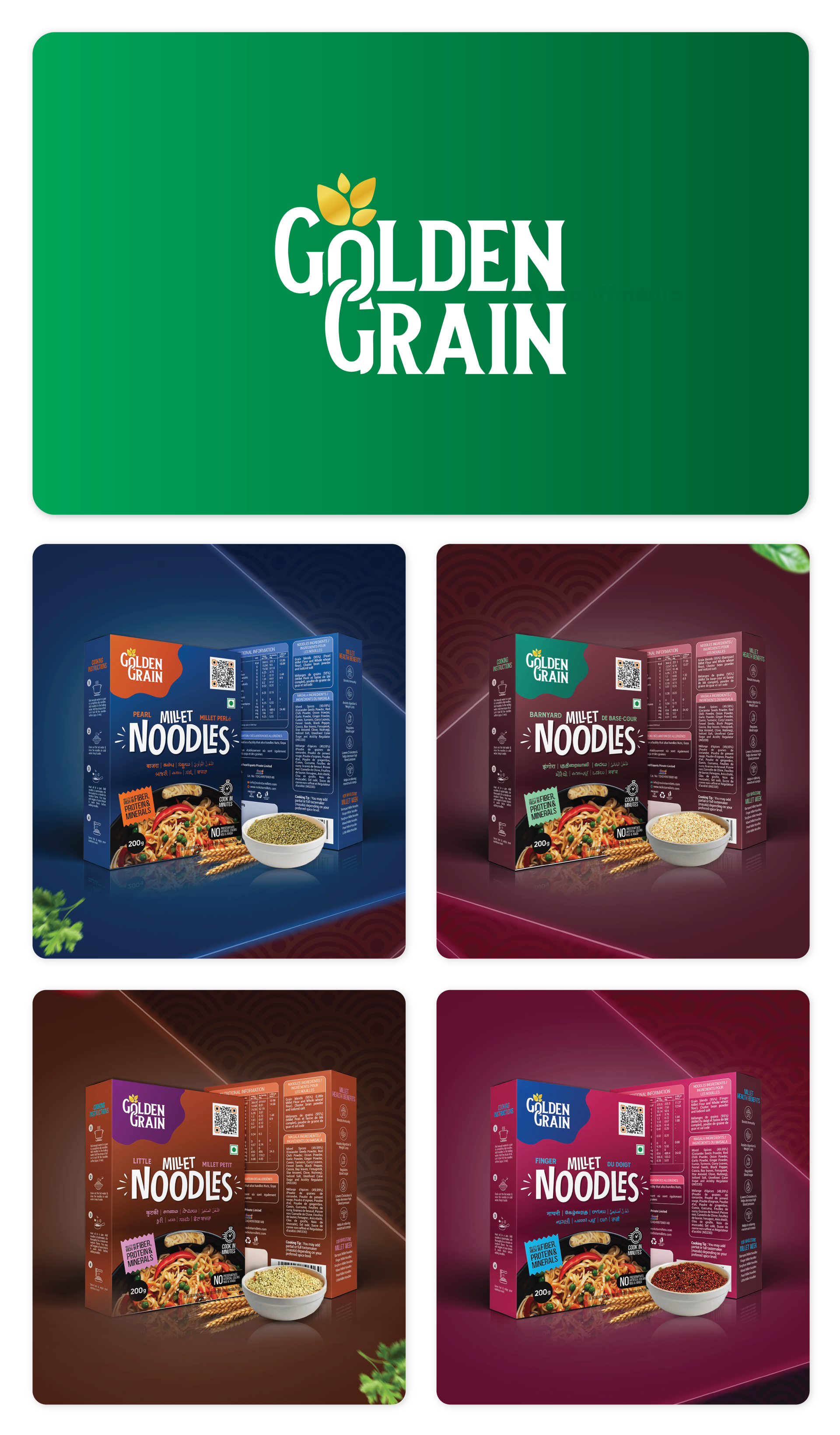
Golden Grain Branding

Golden Grain, a brand offering a variety of noodle products, collaborated with Motiff Media to create a distinctive branding identity that would appeal to consumers seeking quick, delicious meals. The goal was to develop an eye-catching visual identity and packaging that reflects the product’s high quality and flavor diversity.

Task

The task was to design a complete branding solution, including a logo and packaging for various noodle flavors. The design needed to convey the brand’s focus on quality and flavor while being easily recognizable in a competitive food market.

Strategy

The branding strategy focused on a fresh, modern aesthetic while highlighting the quality of the ingredients used in Golden Grain noodles. The design incorporated vibrant colors for each noodle flavor, ensuring the packaging is not only appealing but also easily identifiable. The clean and simple logo reinforces the idea of quality and freshness.

Design

The logo design for Golden Grain is clean, modern, and minimalistic, using bold typography paired with a simple leaf icon to symbolize freshness and natural ingredients. The packaging design incorporates rich, vibrant colors that correspond to each noodle flavor, with imagery that emphasizes the product’s quality and delicious taste. The layout is easy to read, with clear labeling and product information to enhance customer trust and recognition.

Outcome

The branding successfully captures the essence of Golden Grain, helping the brand stand out on retail shelves. The vibrant packaging and modern logo design have enhanced consumer engagement, contributing to stronger brand recognition and market presence.

Client

Golden Grain

Back

Leave a Reply

Your email address will not be published. Required fields are marked *