Taj Mahal Dry Fruits & Nuts

Taj Mahal Dry Fruits & Nuts

Vels Sweets & Snacks

Vels Sweets & Snacks

Velayuthanadar Sweets Indian Savouries

Velayuthanadar Sweets Indian Savouries

Cresco Spirulina Millet Cookies

Cresco Spirulina Millet Cookies

Sadhuragiri SnacksPuffed Rice Balls

Sadhuragiri SnacksPuffed Rice Balls

Rojaa Mark’s Peanut Chikki

Rojaa Mark’s Peanut Chikki

Paskesz Cracker Cuts

Paskesz Cracker Cuts

Taj Mahal Dry Fruits & Nuts

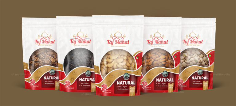
This project involved designing the packaging for Taj Mahal’s range of natural dry fruits and nuts, including walnuts, raisins, cashews, almonds, and pistachios. The…

  • Strategy

    The design incorporates elegant, clean elements with a traditional touch to convey the premium, authentic nature of the product. We ensured the packaging stands out on FMCG retail shelves by using bold, modern typography and a rich red and gold color scheme that evokes quality and luxury. The packaging design also communicates the raw, natural nature of the product through simple, clear language and icons.

  • Design

    The packaging features an elegant design with a soft, intricate pattern in the background, symbolizing the product's premium and natural attributes. The Taj Mahal logo is prominently displayed, conveying the brand’s authenticity and heritage. The "Natural" label is bold and clear, emphasizing the product’s key selling points, while the packaging material itself enhances the sense of premium quality.

  • Client

    Taj Mahal

  • Outcome

    The packaging design effectively communicated the natural, raw, and preservative-free qualities of the product, helping to position Taj Mahal as a premium choice for health-conscious consumers. The eye-catching design helped boost brand recognition and appeal in a competitive market.

  • Tags

    BrandDesign, ConsumerAppeal, CreativePackaging, Custom Design, Dry Fruits, FMCG, Graphic Design, Grocery, Nuts, PackageDesign, ProductPackaging, RetailDesign, Snacks, Stand-Up Pouch

View Project

Velan Snacks

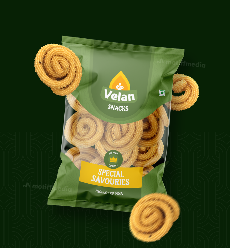
The design project revolves around packaging for Velan Snacks, specifically the Special Savouries snack range, which is a traditional, high-quality Indian snack. The client…

  • Strategy

    To make the packaging stand out on FMCG retail shelves, the design strategy centered on using vibrant green tones to represent freshness and natural ingredients. We made sure the snack was presented in a way that reflected its traditional yet premium quality. The use of a large, clean window to showcase the product added a tactile element, inviting customers to see the snacks inside while maintaining an elegant look.

  • Design

    The design incorporates a clean and modern style, with green tones dominating the background to emphasize freshness and authenticity. The product's name, "Velan Snacks," is prominently featured in an easy-to-read typeface, while the "Special Savouries" text is highlighted in a contrasting color to bring attention to the product category. The packaging also includes icons to reinforce the "premium quality" messaging and the product's origins in India.

  • Client

    Velan Snacks

  • Outcome

    The packaging design successfully balances modern appeal with traditional elements, making it suitable for both new customers and loyal snack enthusiasts. The vibrant green, clean typography, and use of product imagery ensure that Velan Snacks is noticed on the shelf. This fresh and bold approach increases the likelihood of impulse buys, positioning the brand as both a premium and accessible snack choice.

  • Tags

    BrandDesign, Center-Sealed Package, ConsumerAppeal, CreativePackaging, Custom Design, FMCG, Graphic Design, PackageDesign, ProductPackaging, RetailDesign, savouries, Snacks

View Project

Vels Sweets & Snacks

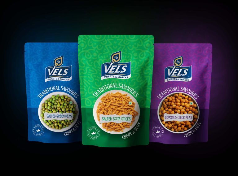
This project involves packaging design for Vels Sweets & Snacks, a brand offering traditional savory snacks like salted green peas, salted soya sticks, and…

  • Strategy

    The design focuses on vibrant colors and patterns, with each snack variety assigned a distinct color to create easy differentiation.The design aims to attract attention while emphasizing the brand's commitment to premium quality; this ensures the packaging stands out on the FMCG retail shelves. Additionally, the packaging clearly communicates the "Traditional Savories" theme to appeal to customers who enjoy authentic snacks.

  • Design

    The design features bold colors (blue, green, purple) for each snack, paired with simple, clean typography for the product name and description. The use of a circular shape at the center of the pack with the product image helps customers quickly understand the product they are buying.

  • Client

    Vels Sweets & Snacks

  • Outcome

    The packaging is designed to stand out in FMCG retail spaces, making it easy for customers to find the snack they want. The clear, attractive design has been positively received for its ease of use and appealing aesthetic.

  • Tags

    BrandDesign, ConsumerAppeal, CreativePackaging, Custom Design, FMCG, Graphic Design, PackageDesign, ProductPackaging, RetailDesign, savouries, Snacks, Sweet

View Project

Velayuthanadar Sweets Indian Savouries

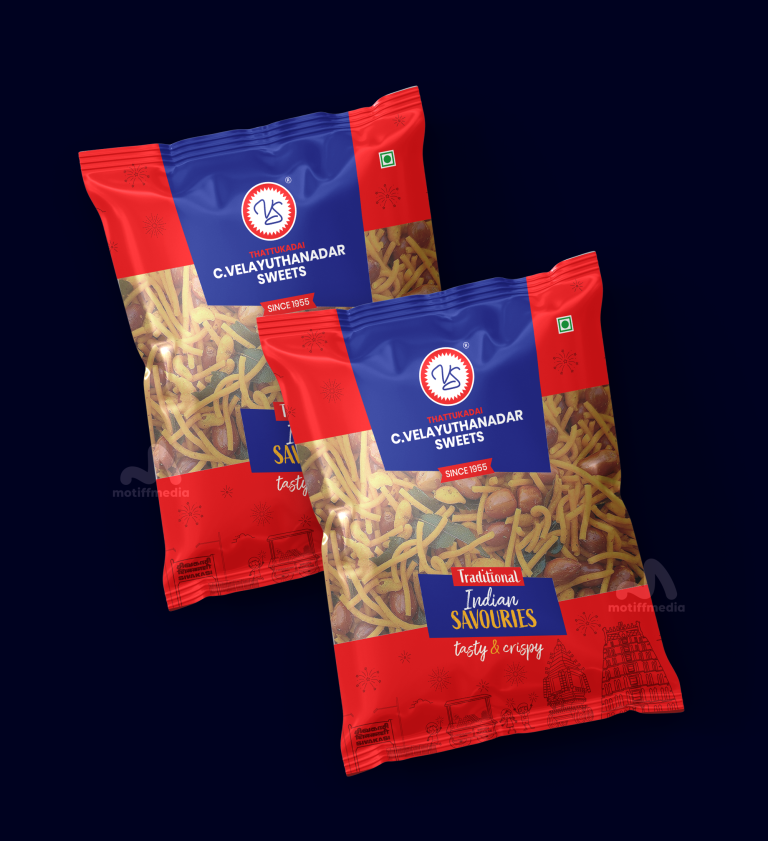
This project involves the packaging design for C. Velayuthanadar Sweets’ Traditional Indian Savouries. The client wanted a design that reflects the authentic taste of…

  • Strategy

    The strategy was to incorporate bright, traditional colors and design elements that convey the essence of Indian culture. The packaging features bold tones to represent warmth and tradition, with gold accents to symbolize the premium nature of the product. We ensured the packaging stands out on FMCG retail shelves by keeping it visually balanced and using clean, legible fonts.

  • Design

    The design features the iconic red and blue color combination with traditional Indian patterns to evoke a sense of nostalgia and authenticity. The use of a photograph of the savoury snacks emphasizes the product's crispy, delicious texture. The logo is prominently placed, and the heritage ("Since 1955") is highlighted to further establish the brand’s legacy.

  • Client

    C. Velayuthanadar Sweets

  • Outcome

    The packaging design successfully communicates the brand’s heritage and product quality. The vibrant colors and traditional elements make it stand out on the shelves, appealing to customers looking for a tasty and authentic snack experience.

  • Tags

    BrandDesign, ConsumerAppeal, CreativePackaging, Custom Design, FMCG, Graphic Design, PackageDesign, ProductPackaging, RetailDesign, savouries, Snacks, Sweet

View Project

Cresco Spirulina Millet Cookies

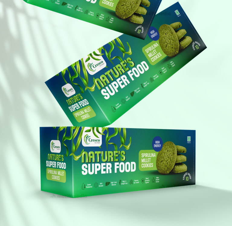
This project involved creating the packaging design for Cresco’s Spirulina Millet Cookies, branded under the tagline “Nature’s Super Food.” The design had to reflect…

  • Strategy

    The design integrates vibrant greens to represent the healthy, natural ingredients of spirulina and millet. We ensured the packaging stands out on FMCG retail shelves through clean, bold typography and high-energy imagery, using a layout that emphasized both the superfood aspect and the snack’s energizing qualities. The packaging communicates both vitality and natural goodness, essential for this health-focused product.

  • Design

    The design highlights the product’s green spirulina color, reinforcing its superfood credentials. It uses organic elements, such as the subtle illustration of millet stalks, to add to the visual appeal and emphasize the natural ingredients. The product’s benefits, such as "High Energy" and "Lower Cholesterol," are clearly highlighted to capture the attention of health-conscious consumers.

  • Client

    Cresco

  • Outcome

    The final packaging successfully conveys the health and energy benefits of the product while ensuring it catches the eye on store shelves. It enhanced Cresco’s brand positioning in the competitive FMCG snack market by promoting health-conscious choices in a visually appealing way.

  • Tags

    BrandDesign, ConsumerAppeal, Cookies, CreativePackaging, Custom Design, FMCG, Graphic Design, Millet, Millet Cookies, Mono carton packaging, PackageDesign, ProductPackaging, RetailDesign, Snacks

View Project

Sadhuragiri SnacksPuffed Rice Balls

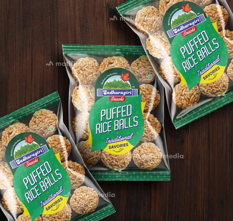
This project involved designing the packaging for Sadhuragiri Snacks, specifically for their Puffed Rice Balls. The product embodies the essence of traditional, healthy savory…

  • Strategy

    The design uses earthy tones and vibrant green elements to highlight the traditional, natural aspect of the product. The label’s font and colors were chosen to resonate with a nostalgic, home-made feel, while also ensuring a modern touch. We ensured the packaging stands out on FMCG retail shelves by using bold, eye-catching typography and incorporating the brand’s mountain imagery. This helped position the product as both premium and authentic.

  • Design

    The design integrates vibrant green colors with imagery of the puffed rice balls themselves, emphasizing the product’s authenticity. The use of a mountain graphic ties into the brand's identity, symbolizing purity and naturalness. The "Traditional Savories" label reinforces the cultural connection and health benefits of the product, while the modern typography ensures the product appeals to younger generations as well.

  • Client

    Sadhuragiri Snacks

  • Outcome

    The final packaging design successfully captures the brand’s traditional roots while appealing to modern consumers. The design’s clean, vibrant look contributed to increased visibility and positive reception in the competitive FMCG market, helping Sadhuragiri Snacks carve out a niche for itself.

  • Tags

    BrandDesign, Center-Sealed Package, ConsumerAppeal, CreativePackaging, Custom Design, FMCG, Graphic Design, PackageDesign, ProductPackaging, Puffed Rice Balls, RetailDesign, Snacks

View Project

Rojaa Mark’s Peanut Chikki

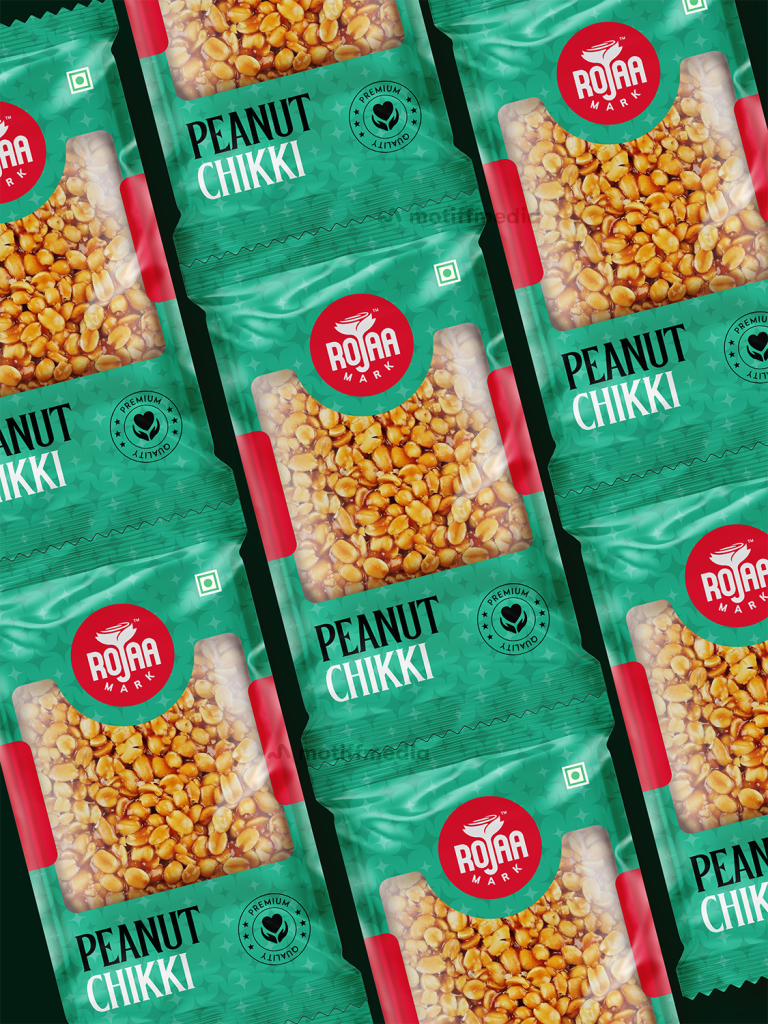
This project focused on designing the packaging for Rojaa Mark’s Peanut Chikki, a traditional Indian sweet made from peanuts and jaggery. The objective was…

  • Strategy

    The design strategy involved using bold colors to make the product stand out in the FMCG market. Green, a color associated with freshness and natural products, was chosen to represent the chikki's authenticity. The packaging was designed to communicate the product's premium quality with a clean, modern layout, incorporating clear text and a friendly, recognizable logo.

  • Design

    The packaging features a prominent display of the product name, "Peanut Chikki," with a bold red logo that adds a sense of familiarity and trust. The background uses a fresh green color to emphasize the product’s natural and high-quality ingredients. The "Premium Quality" tag in a circular format reinforces the product's superior nature, making it more appealing to health-conscious consumers.

  • Client

    Rojaa Mark

  • Outcome

    The packaging design successfully communicated the premium quality of the Peanut Chikki while staying true to its traditional roots. The use of bold colors and modern typography helped the product stand out on retail shelves, contributing to increased consumer interest and brand recognition.

  • Tags

    BrandDesign, ConsumerAppeal, CreativePackaging, Custom Design, FMCG, Graphic Design, PackageDesign, Peanut, Peanut Chikki, ProductPackaging, RetailDesign, Snacks, Sweets

View Project

Paskesz Cracker Cuts

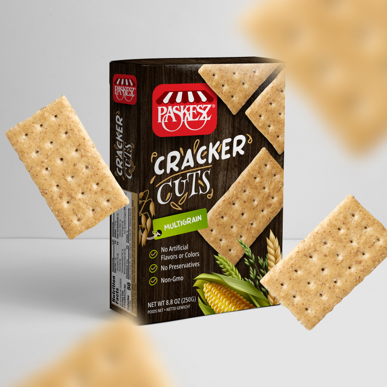
This project involved designing the packaging for Paskesz Cracker Cuts Multigrain, a snack designed for consumers who are looking for healthy, simple, and wholesome…

  • Strategy

    The design uses earthy tones, such as brown and green, to reflect the natural, wholesome qualities of the product. We ensured the packaging stands out on FMCG retail shelves by using large, clear typography for the product name and incorporating icons that emphasize key benefits like "No Artificial Flavors or Colors" and "Non-GMO."

  • Design

    The packaging features a rustic, natural aesthetic with illustrations of wheat and corn to reinforce the multigrain nature of the product. The bold "Cracker Cuts" logo and the product name are placed prominently at the top, with "Multigrain" highlighted in green to catch the consumer's eye. The clean layout and natural imagery make the product feel both approachable and health-conscious.

  • Client

    Paskesz

  • Outcome

    The packaging design successfully conveyed the product's wholesome and healthy nature, contributing to increased consumer trust and interest. The bold, clean design helped the product stand out in a competitive snack market.

  • Tags

    Biscuits, BrandDesign, ConsumerAppeal, CreativePackaging, Custom Design, FMCG, Graphic Design, Mono carton packaging, Multigrain, PackageDesign, ProductPackaging, RetailDesign, Snacks

View Project