
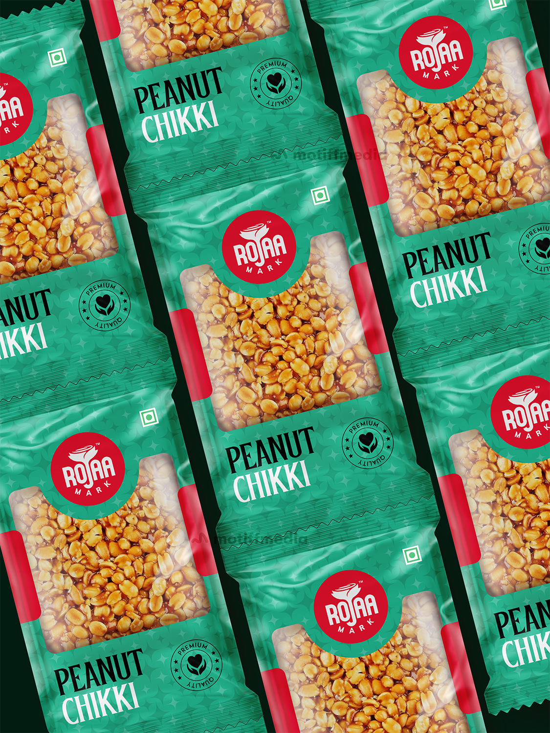
Rojaa Mark’s Peanut Chikki
This project focused on designing the packaging for Rojaa Mark’s Peanut Chikki, a traditional Indian sweet made from peanuts and jaggery. The objective was to create a vibrant, appealing design that communicates the product’s premium quality while staying true to its traditional roots.
Task
The task was to design packaging that effectively highlights the quality of the product, with a focus on the fresh, natural ingredients and its premium quality, while ensuring it stands out on retail shelves.