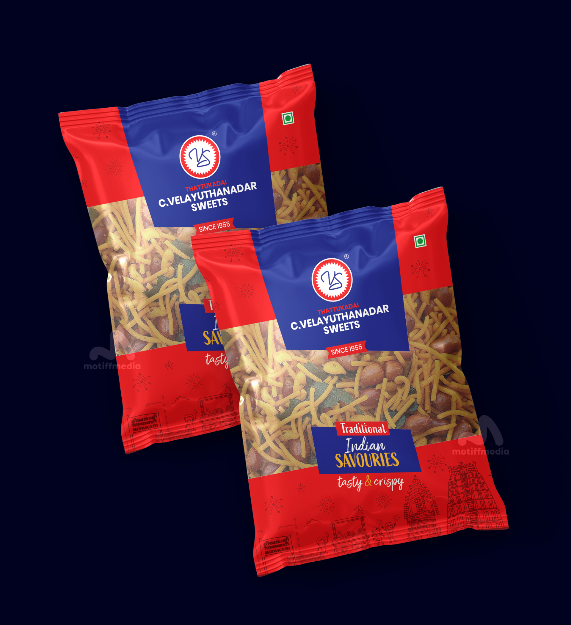
Velayuthanadar Sweets Indian Savouries

This project involves the packaging design for C. Velayuthanadar Sweets’ Traditional Indian Savouries. The client wanted a design that reflects the authentic taste of their sweets while highlighting their long-standing tradition of excellence.

Task

The task was to create eye-catching packaging that resonates with the audience while reinforcing the brand's rich history. The design needed to be modern, yet rooted in tradition, with an emphasis on the product’s taste and crispiness.

Strategy

The strategy was to incorporate bright, traditional colors and design elements that convey the essence of Indian culture. The packaging features bold tones to represent warmth and tradition, with gold accents to symbolize the premium nature of the product. We ensured the packaging stands out on FMCG retail shelves by keeping it visually balanced and using clean, legible fonts.

Design

The design features the iconic red and blue color combination with traditional Indian patterns to evoke a sense of nostalgia and authenticity. The use of a photograph of the savoury snacks emphasizes the product's crispy, delicious texture. The logo is prominently placed, and the heritage ("Since 1955") is highlighted to further establish the brand’s legacy.

Outcome

The packaging design successfully communicates the brand’s heritage and product quality. The vibrant colors and traditional elements make it stand out on the shelves, appealing to customers looking for a tasty and authentic snack experience.

Client

C. Velayuthanadar Sweets

Back

Leave a Reply

Your email address will not be published. Required fields are marked *