Opportuniteas’ Coconut Coffee Mix

Opportuniteas’ Coconut Coffee Mix

Mini Mishkadiapers

Mini Mishkadiapers

Insta Relief Sleep-Aid

Insta Relief Sleep-Aid

Allura Nitrile & Latex Gloves

Allura Nitrile & Latex Gloves

Petsmont Paw Balm

Petsmont Paw Balm

Kilgour MD Scalp Serum

Kilgour MD Scalp Serum

Defend + Hydrate

Defend + Hydrate

ORS Blades & Fades Styling Cream

ORS Blades & Fades Styling Cream

Opportuniteas’ Coconut Coffee Mix

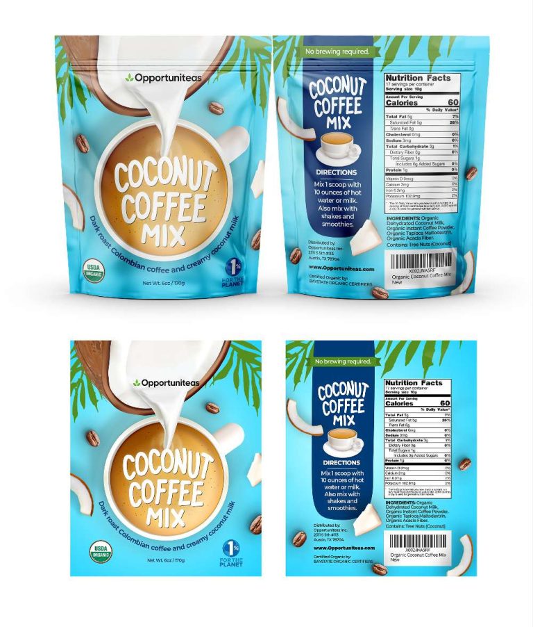
This project focused on crafting the packaging for Opportuniteas’ Coconut Coffee Mix, a unique blend of dark roast Colombian coffee and creamy coconut milk,…

  • Strategy

    The front of the packaging prominently displays the product’s name and highlights the coffee and coconut mix through clean, bold visuals. Clear, concise instructions and sustainability messaging are incorporated on the back, strengthening the product’s green ethos.

  • Design

    The package features a bold title with a simple logo for easy recognition. Coconut milk imagery and dark roast coffee beans highlight the fusion of ingredients. Clear instructions, nutrition facts, and sustainable messaging (1% for the planet) reflect the eco-conscious ethos. A modern, easy-to-read font conveys a healthy, convenient product with the tagline "No brewing required."

  • Client

    Opportuniteas

  • Outcome

    The final design successfully conveys the essence of the product, positioning it as a healthful, eco-friendly option in the competitive coffee market.

  • Tags

    BrandDesign, Coconut Coffee Mix, coffee, Coffee Mix, ConsumerAppeal, CreativePackaging, Custom Design, FMCG, Graphic Design, Grocery, PackageDesign, ProductPackaging, RetailDesign, Stand-Up Pouch

View Project

Mini Mishkadiapers

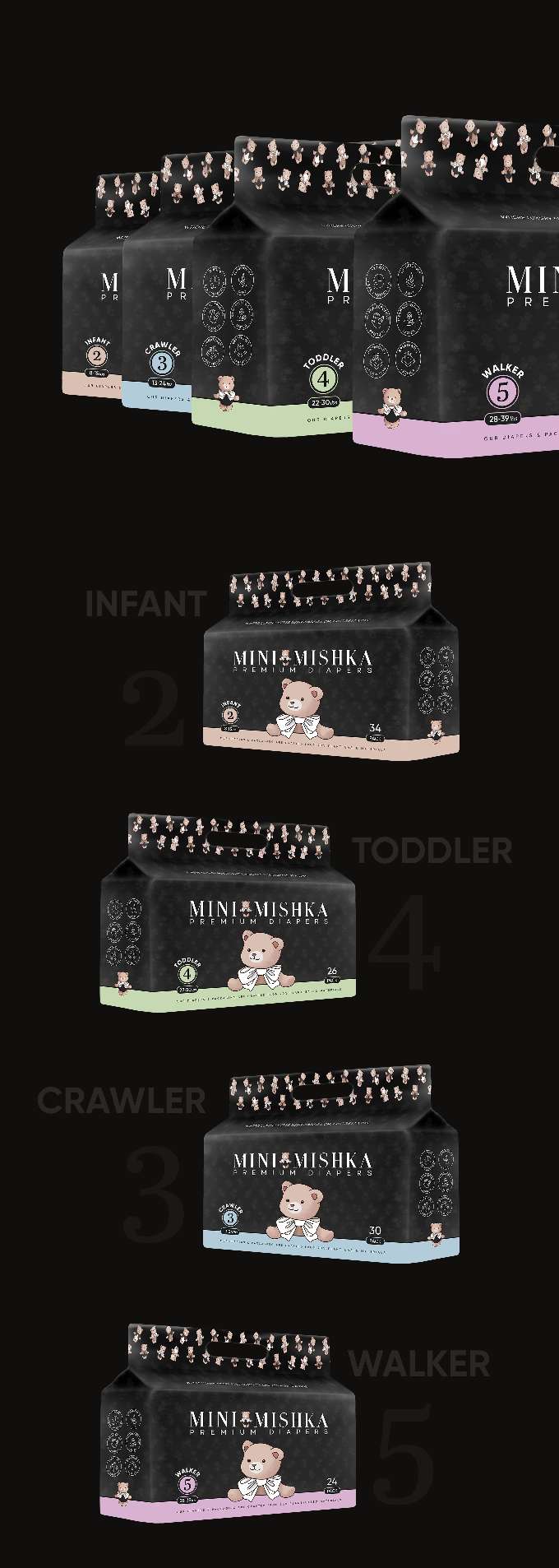
This project focuses on packaging design for a line of premium diapers branded Mini Mishka. The packaging targets parents and caregivers looking for reliable,…

  • Strategy

    We focused on designing packaging that not only communicates the premium quality of the diapers but also emphasizes comfort and care for babies. By including a playful bear mascot on the packaging, we aimed to create a friendly and trustworthy image for the brand. This ensures the packaging stands out in the FMCG retail shelves, especially in the diaper aisle, where clarity and trust are crucial.

  • Design

    The design includes vibrant color schemes tailored to each size, with a simple yet engaging bear mascot wearing a bowtie to add a cute touch. The typography is clean and easy to read, providing essential product information. The packaging also incorporates a convenient handle, enhancing usability.

  • Client

    Mini Mishka

  • Outcome

    The packaging has been well-received for its clarity, attractive design, and ease of use. It stands out on the shelves and helps parents make quick, informed decisions when purchasing baby products.

  • Tags

    BrandDesign, ConsumerAppeal, CreativePackaging, Custom Design, diapers, FMCG, Graphic Design, Guessted Pouch, PackageDesign, Personal Care, ProductPackaging, RetailDesign

View Project

Insta Relief Sleep-Aid

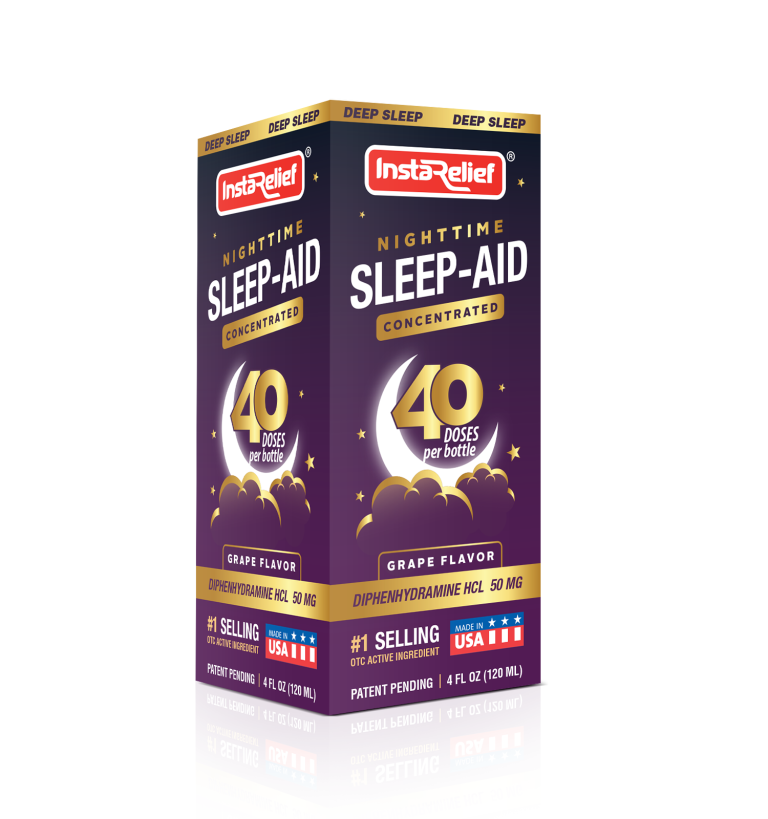
This project involved designing the packaging for InstaRelief’s Nighttime Sleep-Aid Concentrated formula. The client sought a visually compelling package for their sleep-aid product, which…

  • Strategy

    The design strategy was to use deep, calming colors to represent sleep and relaxation, such as rich purples and dark blues. The product's unique value propositions—concentrated formula, 40 doses per bottle, and active ingredient—were prominently displayed. We ensured the packaging stands out on FMCG retail shelves by using a mix of bold typography and soft imagery like clouds and a moon to communicate nighttime relief.

  • Design

    The packaging is structured with a clean, modern aesthetic, featuring bold branding and clear messaging. The use of stars, moon imagery, and a color palette that evokes night and calmness helped reinforce the product’s sleep-aid benefits. The inclusion of the number “40 doses” stands out, emphasizing the value per bottle. The grape flavor is clearly marked to appeal to customers seeking a pleasant taste.

  • Client

    InstaRelief

  • Outcome

    The final packaging design successfully communicated the product's core benefits in a visually appealing way. The design’s use of color and clarity helped the product stand out in the sleep aid section, appealing to customers seeking both effective relief and ease of use.

  • Tags

    BrandDesign, ConsumerAppeal, CreativePackaging, Custom Design, FMCG, Graphic Design, Mono carton packaging, PackageDesign, Personal Care, ProductPackaging, RetailDesign, Sleep-Aid

View Project

Allura Nitrile & Latex Gloves

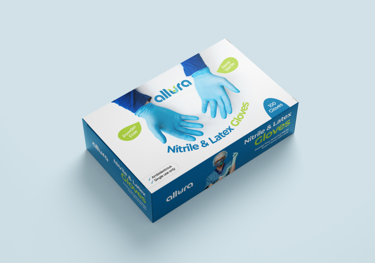
This project involved designing the packaging for Allura’s Nitrile & Latex Gloves, a product aimed at providing reliable hand protection for professionals. The goal…

  • Strategy

    The packaging was designed to be clean and modern, using blue tones to evoke a sense of cleanliness and safety. We ensured the packaging stands out by using simple, bold typography and incorporating icons that highlight key attributes like “Powder Free,” “Non-Sterile,” and “Ambidextrous.”

  • Design

    The design features a large image of the gloves in use, immediately communicating the product’s purpose. The “Allura” brand logo is displayed prominently, with clear, easy-to-read text. The clean layout makes it easy for consumers to quickly understand the product details. Icons for features like “100 Gloves,” “Powder-Free,” and “Non-Sterile” are strategically placed for clarity.

  • Client

    Allura

  • Outcome

    The packaging design successfully conveyed the product’s reliability and high quality, helping it stand out in the competitive market for medical and protective gloves. The clean and professional design helped increase consumer trust and brand recognition.

  • Tags

    BrandDesign, ConsumerAppeal, CreativePackaging, Custom Design, FMCG, Gloves, Graphic Design, Medical, Mono carton packaging, PackageDesign, ProductPackaging, RetailDesign

View Project

Petsmont Paw Balm

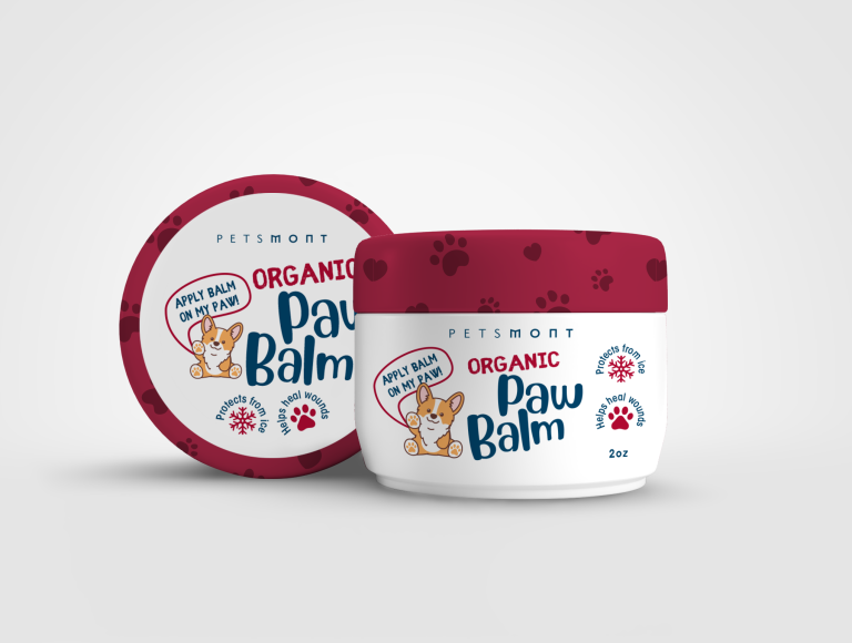
This project focused on designing the packaging for Petsmont’s Organic Paw Balm, a pet care product designed to protect and heal dogs’ paws. The…

  • Strategy

    The design incorporates playful elements such as paw prints and a cute dog illustration to immediately connect with pet owners. We used bright, engaging colors, such as red and white, to evoke a sense of warmth and safety, while the organic focus is communicated through the clean, simple design and natural imagery.

  • Design

    The packaging features a cute dog character alongside playful typography to make the product feel friendly and approachable. The use of paw prints and icons emphasizes the protective and healing benefits of the balm, while the “Organic” label reinforces the product’s natural, high-quality ingredients. The color palette of red and white gives the design a clean and bold look, making the product easily recognizable.

  • Client

    Petsmont

  • Outcome

    The packaging design successfully communicated the product’s key benefits in a fun and approachable way, helping to increase consumer trust and engagement. The playful and vibrant design helped Petsmont stand out in the competitive pet care market.

  • Tags

    BrandDesign, ConsumerAppeal, CreativePackaging, Custom Design, FMCG, Graphic Design, PackageDesign, Paw Balm, Pet care, ProductPackaging, RetailDesign, shrink packaging

View Project

Kilgour MD Scalp Serum

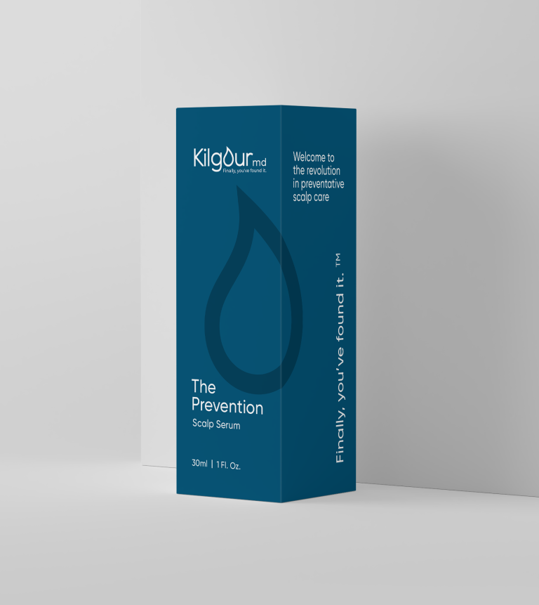
This project involved designing the packaging for Kilgour MD’s scalp serum product, “The Prevention.” The goal was to create an elegant and professional design…

  • Strategy

    The design utilizes a sleek, minimalistic approach with a deep blue color palette, signaling the premium nature of the product. The typography is clean and professional, reinforcing the medical and skincare aspects of the brand. We ensured the packaging stands out on retail shelves by creating a distinct visual identity, with bold product names and a concise tagline that communicates the brand’s innovation.

  • Design

    The packaging features a modern, minimalist design with the product name, "The Prevention," prominently displayed. The visual focus is on a water droplet icon that symbolizes hydration and scalp health. The sleek, simple lines and typography ensure that the packaging looks sophisticated and medical-grade, appealing to health-conscious consumers. The tagline “Finally, you’ve found it” adds a reassuring touch, emphasizing the product’s solution-oriented nature.

  • Client

    Kilgour MD

  • outcome

    The packaging design successfully communicated the product’s innovative and premium qualities, with a clean, professional look that helped it stand out in the competitive skincare market. The sophisticated design resulted in increased consumer interest and brand recognition.

  • Tags

    BrandDesign, ConsumerAppeal, Cosmetic, CreativePackaging, Custom Design, FMCG, Graphic Design, Haircare, Mono carton packaging, PackageDesign, ProductPackaging, RetailDesign, Serum

View Project

Defend + Hydrate

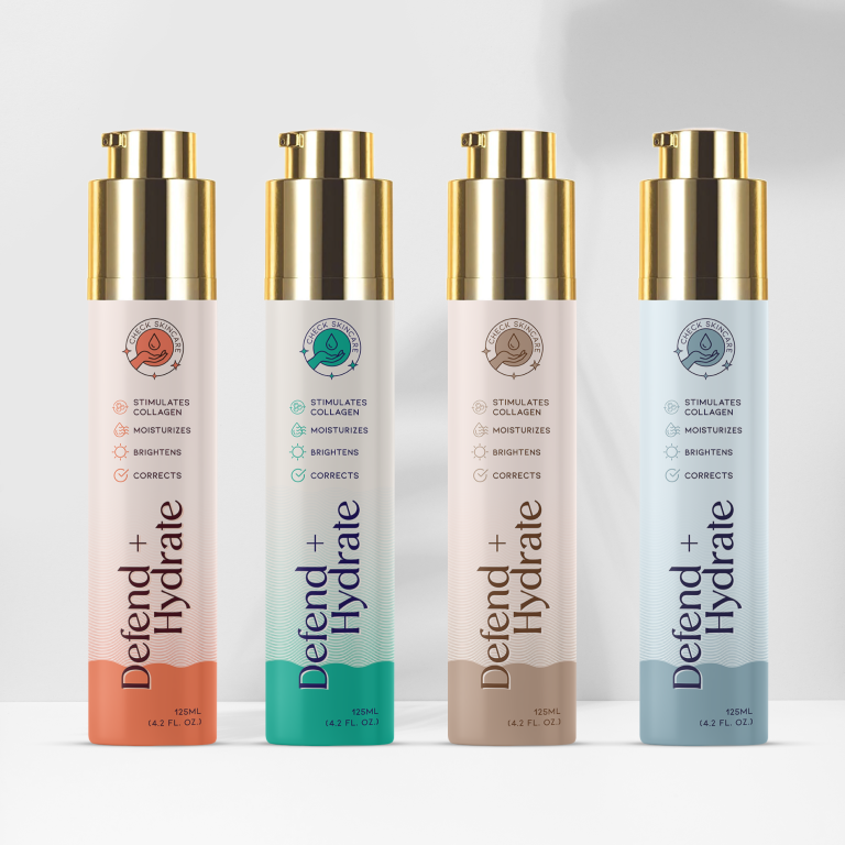
This project focused on designing the packaging for the Defend + Hydrate skincare line, a range of products that stimulate collagen production, moisturize, brighten,…

  • Strategy

    The packaging was designed to stand out on FMCG retail shelves by using a sleek, modern aesthetic with distinct color coding for each variant, making it easy for consumers to identify the specific product benefits. The typography is clean and elegant, and icons are used to visually reinforce the product’s benefits.

  • Design

    The design features tall, elegant bottles with a luxurious gold cap that suggests a premium skincare experience. The color coding for each variant helps differentiate the products: orange, green, beige, and blue tones correspond to different skincare needs. The front labels clearly list the key benefits—stimulates collagen, moisturizes, brightens, and corrects—making it easy for consumers to understand the product's value.

  • Client

    Defend + Hydrate

  • Outcome

    The packaging design successfully communicated the product’s key benefits, helping it stand out in the competitive skincare market. Its modern and premium look helped increase consumer engagement and brand recognition.

  • Tags

    BrandDesign, ConsumerAppeal, Cosmetic, CreativePackaging, Custom Design, FMCG, Graphic Design, PackageDesign, ProductPackaging, RetailDesign, shrink packaging, Skincare

View Project

ORS Blades & Fades Styling Cream

The project focuses on the design of a Blades & Fades Styling Cream packaging under the ORS brand. This product, formulated with olive oil,…

  • Strategy

    The design utilizes a blend of earthy tones like green to highlight the natural ingredients (olive oil, hops, aloe vera) and to convey a sense of quality and reliability. We aimed to give the packaging a masculine, yet approachable feel, making it suitable for both beard care and styling. The combination of clear typography and icons helps convey key benefits and product usage.

  • Design

    The packaging uses an elegant green color palette with subtle gradients and gold accents to make it stand out. A clear, easy-to-read font provides product information, while the icons representing the ingredients emphasize the natural and high-quality nature of the product. The sleek bottle design gives a premium look, perfect for retail.

  • Client

    ORS

  • Outcome

    The product's design is clean, professional, and appealing to the target audience. Its premium appearance and clear messaging are expected to drive attention and encourage purchase from consumers looking for high-quality beard styling solutions.

  • Tags

    BrandDesign, ConsumerAppeal, Cosmetic, CreativePackaging, Custom Design, FMCG, Graphic Design, Lable packaging, Oil, olive oil, PackageDesign, ProductPackaging, RetailDesign, Styling Cream

View Project