Insta Relief Sleep-Aid

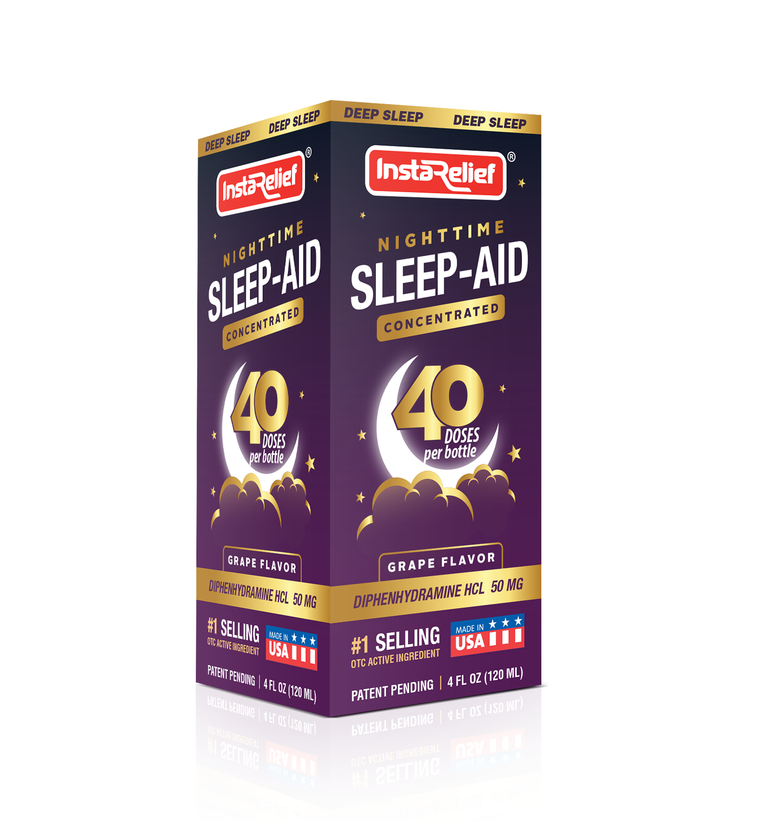
This project involved designing the packaging for InstaRelief’s Nighttime Sleep-Aid Concentrated formula. The client sought a visually compelling package for their sleep-aid product, which provides deep sleep solutions to customers. The design needed to communicate the product’s efficacy, convenience, and premium nature.

Task

The task was to create a packaging design that effectively conveyed the product's key features, including its ability to aid deep sleep, its concentrated formula providing 40 doses per bottle, and its ease of use. The packaging also needed to convey the product’s pharmaceutical reliability while highlighting its grape flavor and concentrated formula.

Strategy

The design strategy was to use deep, calming colors to represent sleep and relaxation, such as rich purples and dark blues. The product's unique value propositions—concentrated formula, 40 doses per bottle, and active ingredient—were prominently displayed. We ensured the packaging stands out on FMCG retail shelves by using a mix of bold typography and soft imagery like clouds and a moon to communicate nighttime relief.

Design

The packaging is structured with a clean, modern aesthetic, featuring bold branding and clear messaging. The use of stars, moon imagery, and a color palette that evokes night and calmness helped reinforce the product’s sleep-aid benefits. The inclusion of the number “40 doses” stands out, emphasizing the value per bottle. The grape flavor is clearly marked to appeal to customers seeking a pleasant taste.

Outcome

The final packaging design successfully communicated the product's core benefits in a visually appealing way. The design’s use of color and clarity helped the product stand out in the sleep aid section, appealing to customers seeking both effective relief and ease of use.

Client

InstaRelief

Back

Leave a Reply

Your email address will not be published. Required fields are marked *