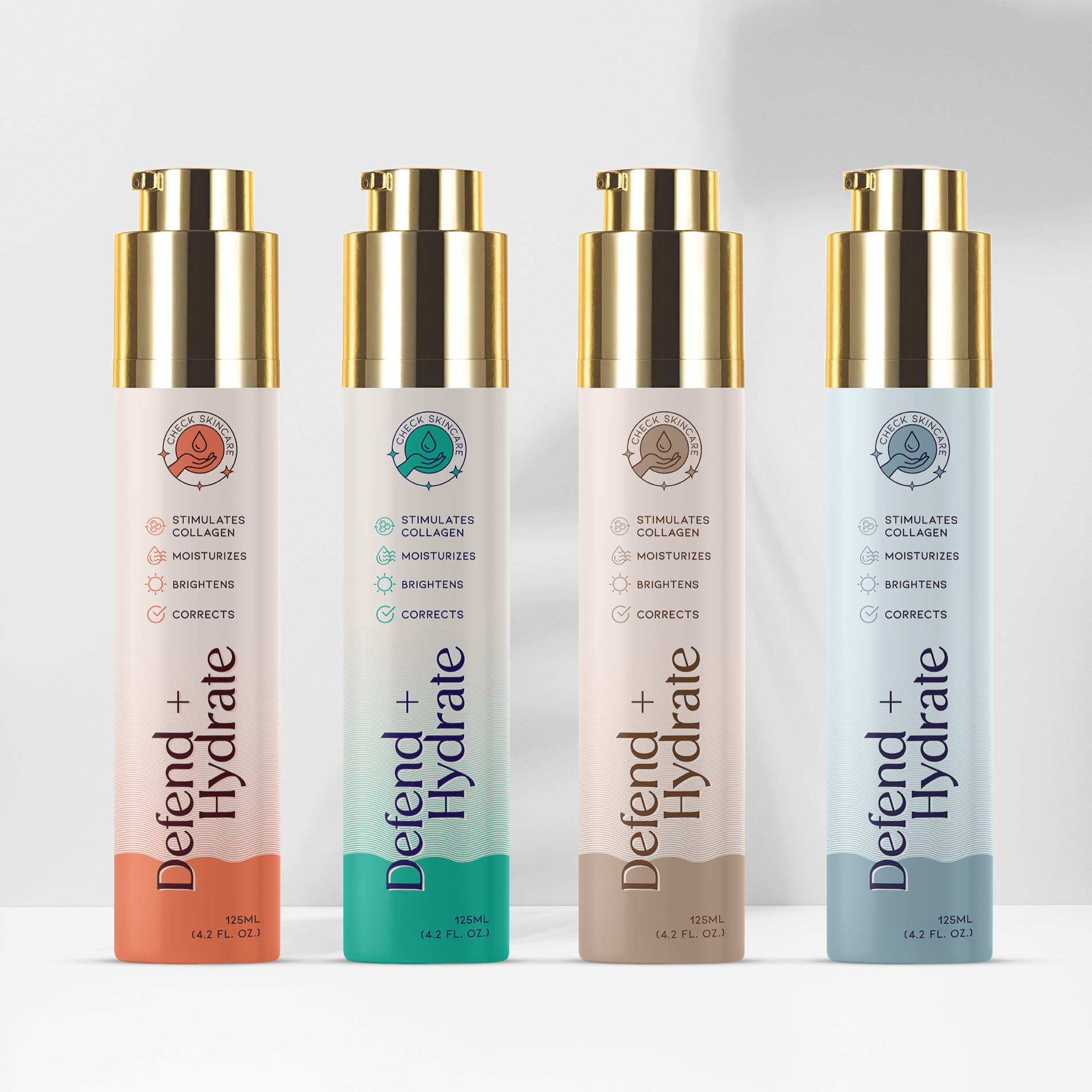
Defend + Hydrate

This project focused on designing the packaging for the Defend + Hydrate skincare line, a range of products that stimulate collagen production, moisturize, brighten, and correct the skin. The objective was to create a design that clearly communicates the product’s skincare benefits while reflecting its premium nature.

Task

The task was to design packaging that effectively highlights the product's benefits, such as stimulating collagen, moisturizing, and brightening the skin. The design needed to be visually appealing to consumers seeking high-quality, effective skincare products.

Strategy

The packaging was designed to stand out on FMCG retail shelves by using a sleek, modern aesthetic with distinct color coding for each variant, making it easy for consumers to identify the specific product benefits. The typography is clean and elegant, and icons are used to visually reinforce the product’s benefits.

Design

The design features tall, elegant bottles with a luxurious gold cap that suggests a premium skincare experience. The color coding for each variant helps differentiate the products: orange, green, beige, and blue tones correspond to different skincare needs. The front labels clearly list the key benefits—stimulates collagen, moisturizes, brightens, and corrects—making it easy for consumers to understand the product's value.

Outcome

The packaging design successfully communicated the product’s key benefits, helping it stand out in the competitive skincare market. Its modern and premium look helped increase consumer engagement and brand recognition.

Client

Defend + Hydrate

Back

Leave a Reply

Your email address will not be published. Required fields are marked *