Alfanoos Coffee Premium Natural Cloves

Alfanoos Coffee Premium Natural Cloves

Taj Mahal Original Pulses

Taj Mahal Original Pulses

Payir Premium Rice

Payir Premium Rice

Zodiac Masala’s Maida Flour

Zodiac Masala’s Maida Flour

Jayaம் Almonds

Jayaம் Almonds

 Heritage Harvest Black Pepper

 Heritage Harvest Black Pepper

Alfanoos Coffee Premium Natural Cloves

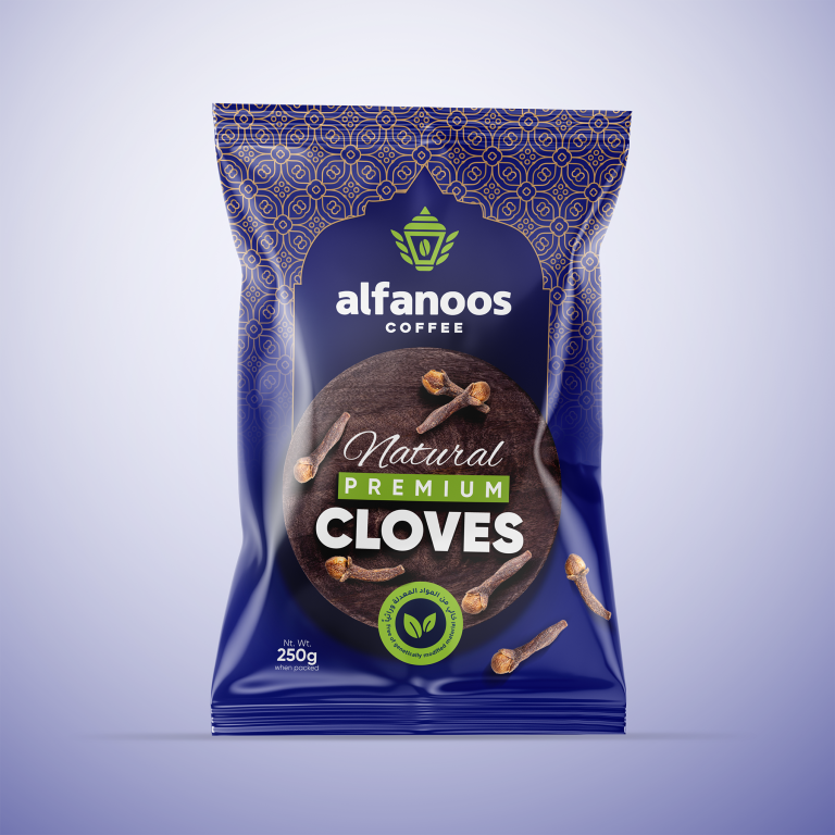
This project involved creating the packaging design for Alfanoos Coffee’s premium natural cloves. The goal was to design an elegant and authentic packaging that…

  • Strategy

    We adopted a minimal yet sophisticated approach, using a blend of clean typography, earthy tones, and a touch of modern design elements, ensuring the packaging stood out on FMCG retail shelves.  The use of natural imagery (cloves) and the inclusion of eco-friendly icons helped to highlight the product’s premium and organic nature.

  • Design

    The design features a rich purple background that contrasts well with the natural cloves and emphasizes the premium look. The sleek logo placement, along with the prominent 'Natural Premium' text, communicates the high-quality nature of the cloves. The eco-friendly emblem adds an authentic, sustainable touch to the packaging.

  • Client

    Alfanoos

  • Outcome

    The packaging design successfully captured the essence of the brand, appealing to the target market by emphasizing the product's quality and natural ingredients. It enhanced shelf presence and reinforced the premium positioning of Alfanoos Coffee.

  • Tags

    BrandDesign, Center-Sealed Package, Cloves, ConsumerAppeal, CreativePackaging, Custom Design, FMCG, Graphic Design, Grocery, PackageDesign, ProductPackaging, RetailDesign

View Project

Taj Mahal Original Pulses

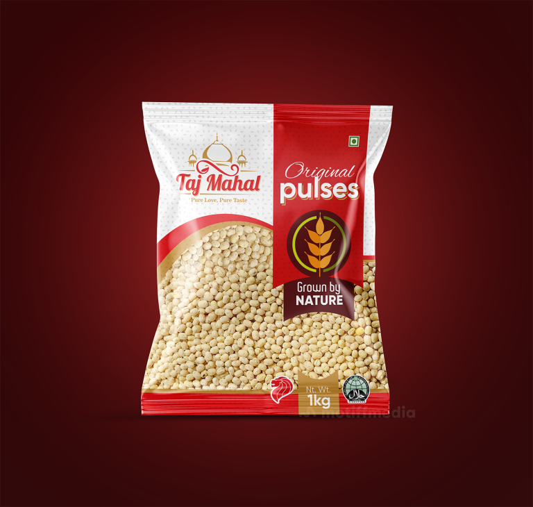
This project involved designing the packaging for Taj Mahal’s Original Pulses, aiming to create an attractive and premium package that communicates the natural, authentic…

  • Strategy

    The design incorporates a clean and vibrant color palette with the red and white scheme representing freshness and purity. We ensured the packaging stands out on FMCG retail shelves by using a modern font for the product name, "Original Pulses," while keeping the traditional elements intact with a strong focus on the "Grown by Nature" label. This approach emphasized the authenticity and quality of the product.

  • Design

    The design features bold typography with "Original Pulses" prominently displayed, and the "Grown by Nature" message is highlighted to convey the product’s natural origins. The Taj Mahal logo is featured at the top, reinforcing the brand's identity. The simple and clear design emphasizes the product’s premium nature, while the use of red and gold color accents adds a touch of luxury.

  • Client

    Taj Mahal

  • Outcome

    The packaging effectively highlighted the product's premium, natural quality, boosting consumer interest and reinforcing Taj Mahal's leadership in the pulses market. Its modern yet authentic design enhanced brand recognition on retail shelves.

  • Tags

    BrandDesign, Center-Sealed Package, ConsumerAppeal, CreativePackaging, Custom Design, FMCG, Graphic Design, Grocery, PackageDesign, ProductPackaging, Pulses, RetailDesign

View Project

Payir Premium Rice

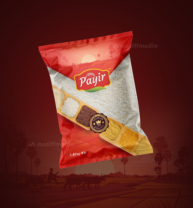
This project involved designing the packaging for Payir’s premium rice product. The aim was to create a packaging design that reflects the authenticity and…

  • Strategy

    The design uses a rich red background to evoke warmth and tradition, while the rice imagery is complemented by a landscape silhouette that reinforces the rural, authentic origins of the product. We ensured the packaging stands out on FMCG retail shelves by incorporating the “Premium” label and showcasing the rice's high quality. The clean design is aimed at modern consumers who are looking for authentic, high-end food products

  • Design

    The packaging features a bold red color with a picturesque sunset and rural landscape in the background, representing the natural origins of the rice. The front showcases a wooden tray with a variety of rice types, further emphasizing the quality and variety of the product. The Payir logo is prominently displayed, and the "100% Premium Quality" label highlights the rice's premium nature. The clean, modern layout and color scheme make the product both eye-catching and approachable.

  • Client

    Payir

  • Outcome

    The packaging design successfully communicated the rice’s premium quality and natural, traditional origins, helping it stand out on the retail shelves. The visual appeal and clear messaging contributed to an increase in consumer interest and brand recognition.

  • Tags

    BrandDesign, Center-Sealed Package, ConsumerAppeal, CreativePackaging, Custom Design, FMCG, Graphic Design, Grocery, PackageDesign, ProductPackaging, RetailDesign, Rice

View Project

Vimal Elaichi

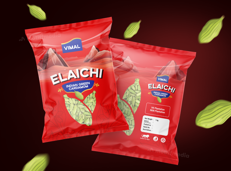
The project focuses on designing packaging for Vimal Elaichi (Indian Green Cardamom), a premium product harvested from renowned VK and RKN plantations. The design…

  • Strategy

    The design strategy included using bright, bold colors like red to catch attention on retail shelves. We ensured the packaging stands out on FMCG shelves by placing emphasis on the product's key elements, like its premium quality and sourcing from reputed plantations. The graphics of cardamom pods floating around the pack give a fresh and dynamic feel, reinforcing the product’s natural origins.

  • Design

    The design incorporates vivid red tones for a bold, eye-catching look. The product’s name, "Elaichi," is prominently displayed in a large, playful font to emphasize its identity. The background features a stylized landscape of mountains to represent the regions where the cardamom is grown, enhancing the story of the product's origin. The design includes a clean, minimal layout for the ingredient and weight details, making the information easy to read while keeping the focus on the product’s natural appeal.

  • Client

    Vimal

  • Outcome

    The packaging effectively communicates the premium quality of the Elaichi, with a modern yet earthy design that appeals to both traditional and modern consumers. The clean, bold graphics make it stand out in retail environments, and the design helps establish a strong brand identity for Vimal Elaichi.

  • Tags

    BrandDesign, Cardamom, Center-Sealed Package, ConsumerAppeal, CreativePackaging, Custom Design, Elaichi, FMCG, Graphic Design, PackageDesign, ProductPackaging, RetailDesign

View Project

Zodiac Masala’s Maida Flour

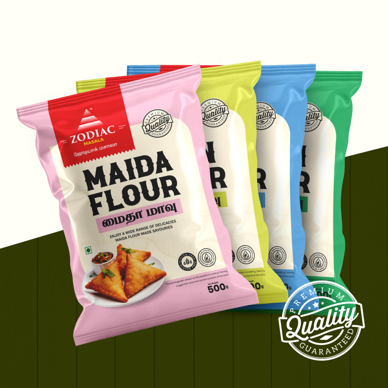
This project focuses on the design for Zodiac Masala’s Maida Flour packaging. The client, Zodiac Masala, a renowned brand for food products, aimed to…

  • Strategy

    The strategy involved using bold, bright colors to differentiate between different varieties of Maida Flour. The focus was on clarity, making the product easily recognizable. Additionally, we made sure to include the "Premium Quality" seal to reinforce the product’s superior grade. We ensured the packaging stands out on FMCG retail shelves by utilizing clear typography, vivid colors, and engaging imagery like a freshly prepared snack (Samosa) that resonates with the culinary use of Maida Flour.

  • Design

    The design uses a colorful palette with distinct shades for different variants (pink, yellow, blue, and green) to create a visually appealing and cohesive range. Each color was chosen to evoke freshness and appeal to customers. The "Premium Quality Guaranteed" label is prominently featured to build trust. The clean, modern font ensures easy readability, and the image of a samosa directly ties the flour’s use to tasty, homemade delights.

  • Client

    Zodiac Masala

  • Outcome

    The final design captures the essence of freshness and quality. The bright, cheerful colors and modern style make the packaging stand out in the FMCG market. The design successfully communicates both the versatility and premium nature of the Maida Flour while maintaining the traditional appeal that customers trust.

  • Tags

    BrandDesign, Center-Sealed Package, ConsumerAppeal, CreativePackaging, Custom Design, Flour, FMCG, Graphic Design, Grocery, Maida Flour, Masala, PackageDesign, ProductPackaging, RetailDesign

View Project

Jayaம் Almonds

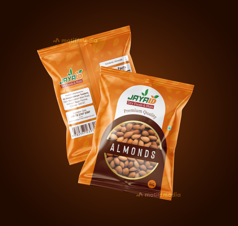
This project involved designing the packaging for Jayaம்’s Almonds, a premium quality dry food product. The objective was to create a design that communicates…

  • Strategy

    The design incorporates vibrant, earthy colors like orange to evoke a sense of freshness and natural quality. We ensured the packaging stands out on FMCG retail shelves by using large, bold fonts for the product name and creating a clear visual connection to the almonds through a close-up image on the front.

  • Design

    The packaging features an orange color palette with leaf accents, which emphasizes the natural and fresh quality of the almonds. The "Premium Quality" text is prominently displayed to reinforce the high-end nature of the product. The logo of "Jayaம்" is clean and easily recognizable, with the product name “Almonds” centered in a bold font. The back of the package includes necessary product information in a clear layout.

  • Client

    Jayaம்

  • Outcome

    The packaging design successfully communicated the premium and natural qualities of the almonds, helping to enhance the brand’s identity and attract consumers. The clear and vibrant design made the product stand out in a competitive market.

  • Tags

    Almonds, BrandDesign, Center-Sealed Package, ConsumerAppeal, CreativePackaging, Custom Design, FMCG, food, Graphic Design, Grocery, PackageDesign, ProductPackaging, RetailDesign

View Project

 Heritage Harvest Black Pepper

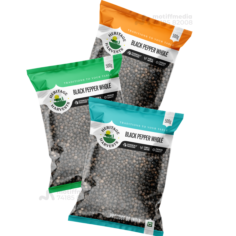
This project involved designing the packaging for Heritage Harvests’ range of Black Pepper Whole products. The goal was to create a design that communicates…

  • Strategy

    The design was created to stand out on FMCG retail shelves by using vibrant colors—green, orange, and blue—to differentiate between the different product variants. We made sure to clearly communicate the product's premium quality, natural processing, and the heritage behind it.

  • Design

    Each packaging variant uses a different color for easy identification, while maintaining a clean and cohesive brand aesthetic. The logo, featuring the “Heritage Harvests” name and an image of greenery, reinforces the traditional, natural roots of the product. The text clearly highlights key selling points such as “Premium Quality” and “Naturally Processed.”

  • Client

    Heritage Harvests

  • Outcome

    The packaging design successfully conveyed the product’s premium quality and natural authenticity, leading to increased brand recognition and consumer engagement. The distinctive colors made it easier for consumers to identify the product on shelves.

  • Tags

    BrandDesign, Center-Sealed Package, ConsumerAppeal, CreativePackaging, Custom Design, FMCG, Graphic Design, Grocery, PackageDesign, Pepper, ProductPackaging, RetailDesign

View Project

Velan Snacks

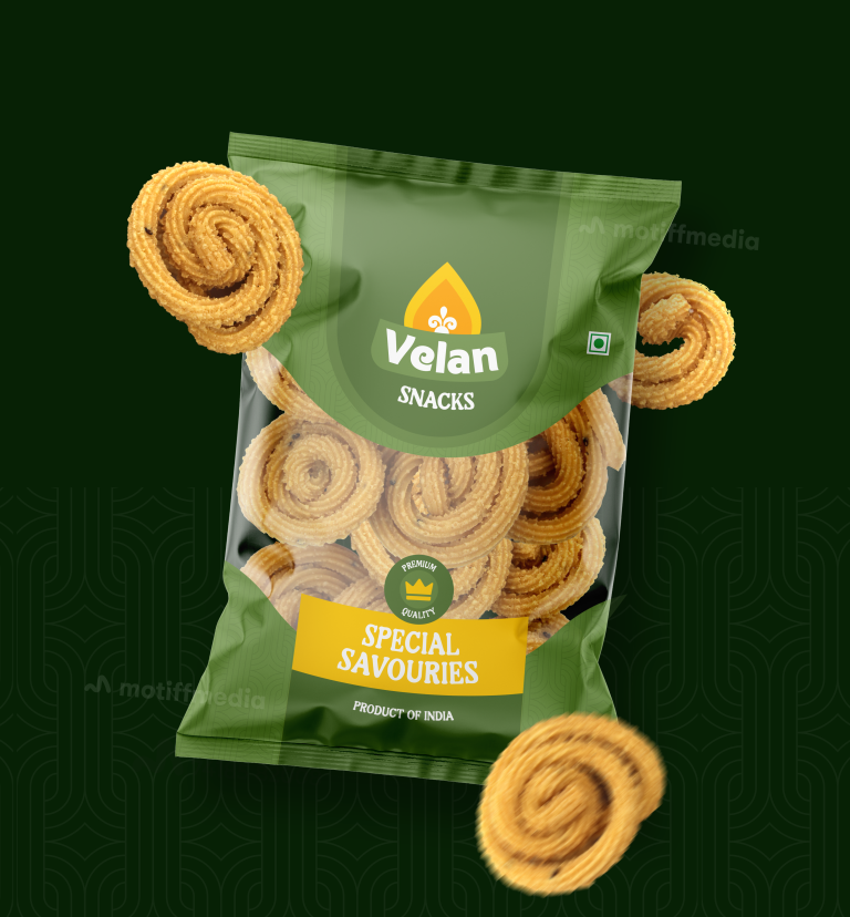
The design project revolves around packaging for Velan Snacks, specifically the Special Savouries snack range, which is a traditional, high-quality Indian snack. The client…

  • Strategy

    To make the packaging stand out on FMCG retail shelves, the design strategy centered on using vibrant green tones to represent freshness and natural ingredients. We made sure the snack was presented in a way that reflected its traditional yet premium quality. The use of a large, clean window to showcase the product added a tactile element, inviting customers to see the snacks inside while maintaining an elegant look.

  • Design

    The design incorporates a clean and modern style, with green tones dominating the background to emphasize freshness and authenticity. The product's name, "Velan Snacks," is prominently featured in an easy-to-read typeface, while the "Special Savouries" text is highlighted in a contrasting color to bring attention to the product category. The packaging also includes icons to reinforce the "premium quality" messaging and the product's origins in India.

  • Client

    Velan Snacks

  • Outcome

    The packaging design successfully balances modern appeal with traditional elements, making it suitable for both new customers and loyal snack enthusiasts. The vibrant green, clean typography, and use of product imagery ensure that Velan Snacks is noticed on the shelf. This fresh and bold approach increases the likelihood of impulse buys, positioning the brand as both a premium and accessible snack choice.

  • Tags

    BrandDesign, Center-Sealed Package, ConsumerAppeal, CreativePackaging, Custom Design, FMCG, Graphic Design, PackageDesign, ProductPackaging, RetailDesign, savouries, Snacks

View Project