
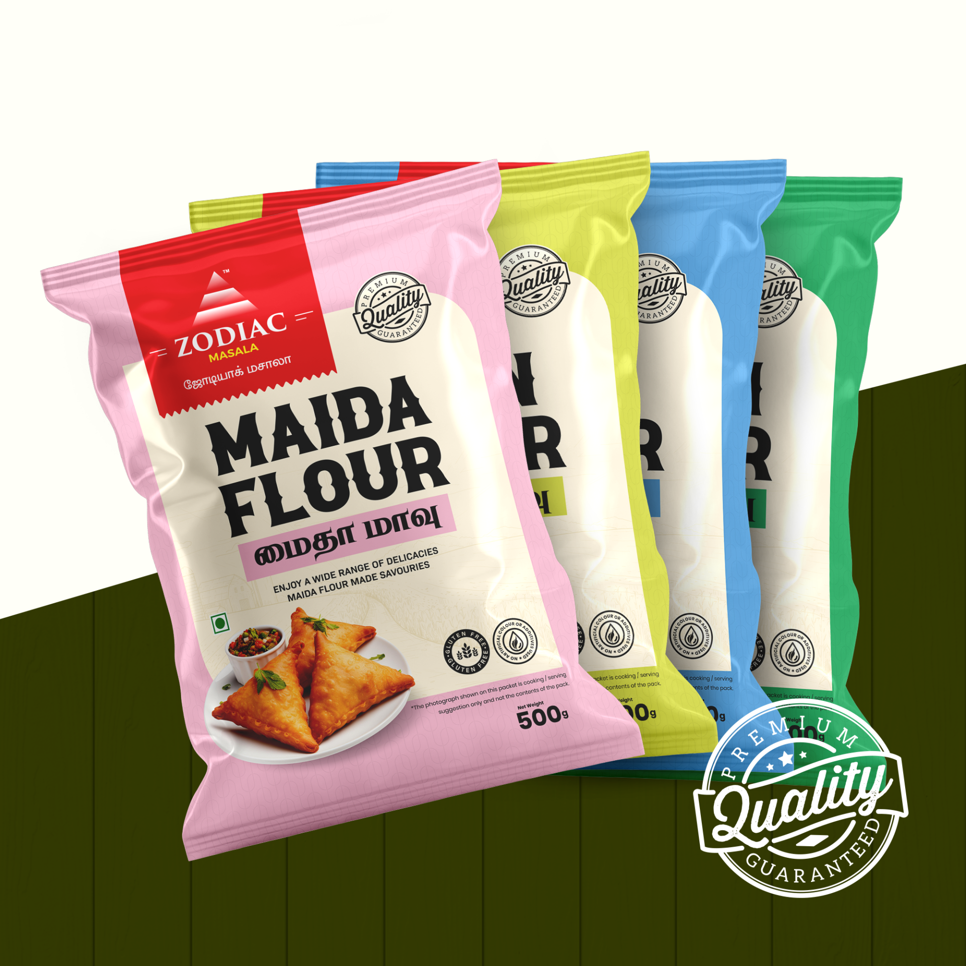
Zodiac Masala’s Maida Flour
This project focuses on the design for Zodiac Masala’s Maida Flour packaging. The client, Zodiac Masala, a renowned brand for food products, aimed to redesign their packaging to attract attention in the competitive FMCG market while emphasizing their premium quality.
Task
The task was to create a fresh, modern, and vibrant design for Maida Flour packaging that not only highlights its premium quality but also makes it stand out on the FMCG retail shelves. The design needed to appeal to the consumer’s desire for high-quality, versatile flour for various delicacies.