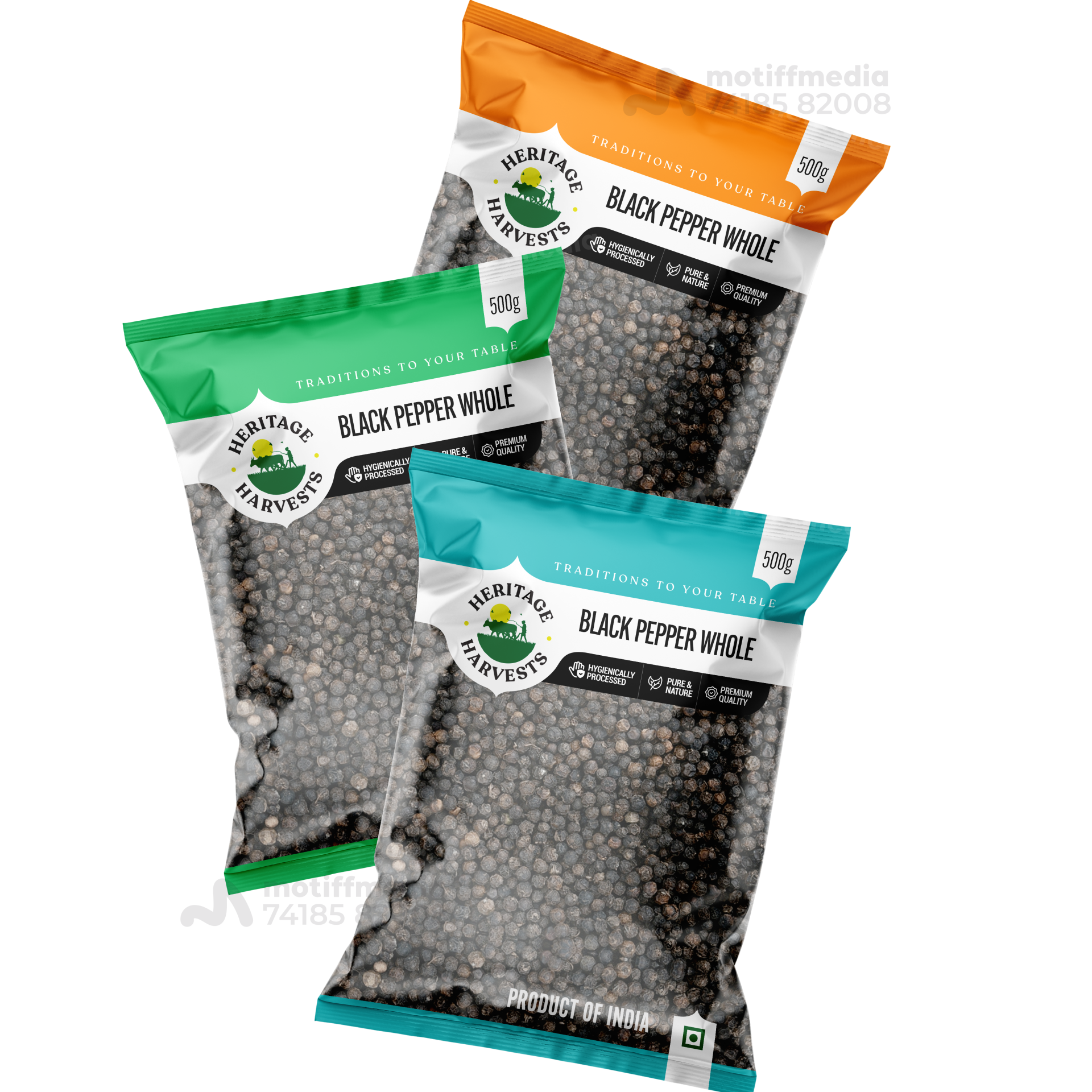
Heritage Harvest Black Pepper

This project involved designing the packaging for Heritage Harvests’ range of Black Pepper Whole products. The goal was to create a design that communicates the premium quality of the pepper, while also highlighting its natural and traditional roots.

Task

The task was to design packaging that would stand out on retail shelves and appeal to consumers who value high-quality, natural spices. The design had to emphasize the product’s authenticity and purity.

Strategy

The design was created to stand out on FMCG retail shelves by using vibrant colors—green, orange, and blue—to differentiate between the different product variants. We made sure to clearly communicate the product's premium quality, natural processing, and the heritage behind it.

Design

Each packaging variant uses a different color for easy identification, while maintaining a clean and cohesive brand aesthetic. The logo, featuring the “Heritage Harvests” name and an image of greenery, reinforces the traditional, natural roots of the product. The text clearly highlights key selling points such as “Premium Quality” and “Naturally Processed.”

Outcome

The packaging design successfully conveyed the product’s premium quality and natural authenticity, leading to increased brand recognition and consumer engagement. The distinctive colors made it easier for consumers to identify the product on shelves.

Client

Heritage Harvests

Back

Leave a Reply

Your email address will not be published. Required fields are marked *