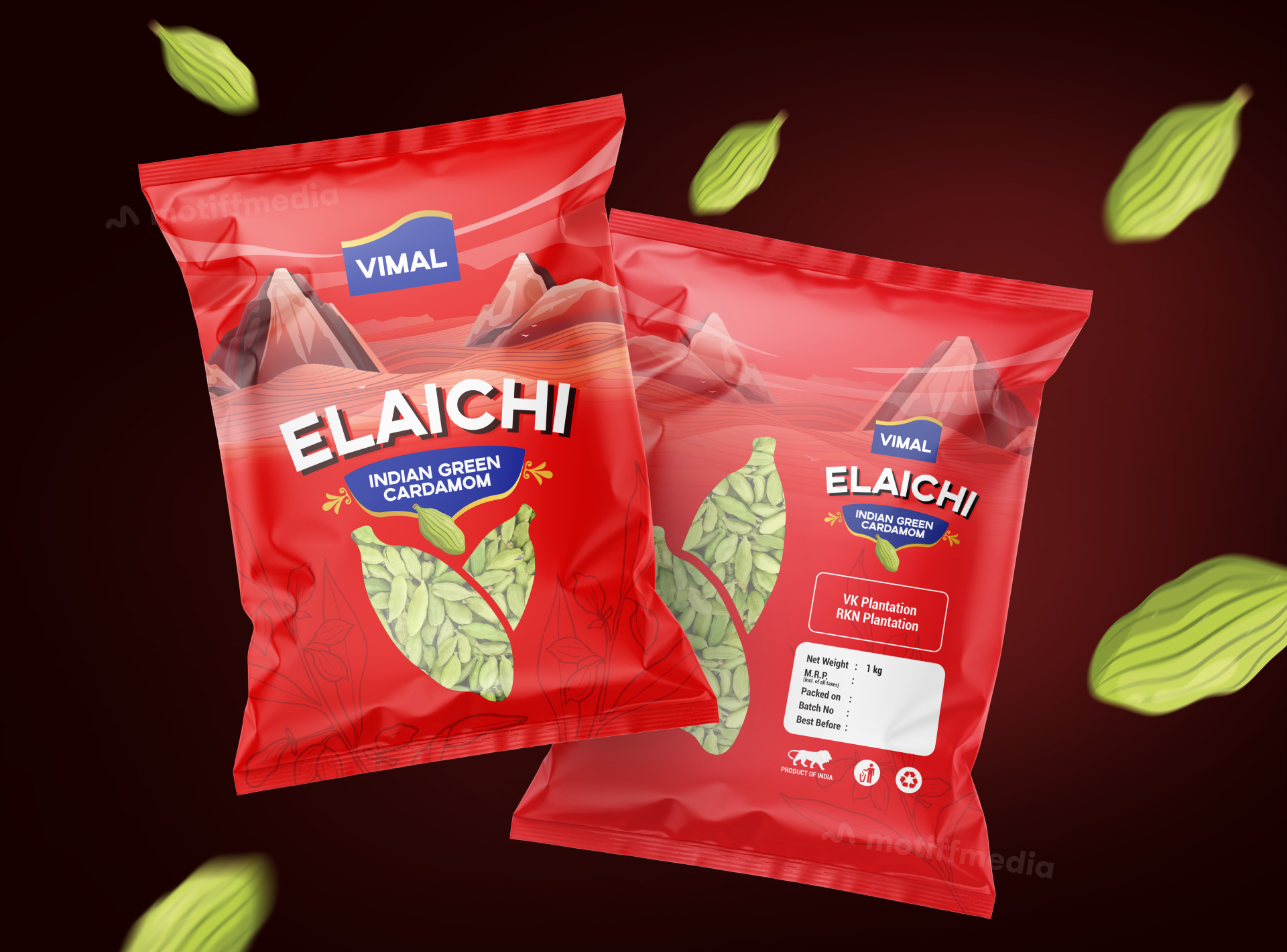
Vimal Elaichi

The project focuses on designing packaging for Vimal Elaichi (Indian Green Cardamom), a premium product harvested from renowned VK and RKN plantations. The design needed to highlight the product’s authentic quality and premium nature, while also appealing to a broad audience.

Task

The task was to develop a visually striking packaging design that communicates both the traditional appeal and premium nature of the cardamom. The packaging had to stand out on FMCG retail shelves and be instantly recognizable.

Strategy

The design strategy included using bright, bold colors like red to catch attention on retail shelves. We ensured the packaging stands out on FMCG shelves by placing emphasis on the product's key elements, like its premium quality and sourcing from reputed plantations. The graphics of cardamom pods floating around the pack give a fresh and dynamic feel, reinforcing the product’s natural origins.

Design

The design incorporates vivid red tones for a bold, eye-catching look. The product’s name, "Elaichi," is prominently displayed in a large, playful font to emphasize its identity. The background features a stylized landscape of mountains to represent the regions where the cardamom is grown, enhancing the story of the product's origin. The design includes a clean, minimal layout for the ingredient and weight details, making the information easy to read while keeping the focus on the product’s natural appeal.

Outcome

The packaging effectively communicates the premium quality of the Elaichi, with a modern yet earthy design that appeals to both traditional and modern consumers. The clean, bold graphics make it stand out in retail environments, and the design helps establish a strong brand identity for Vimal Elaichi.

Client

Vimal

Back

Leave a Reply

Your email address will not be published. Required fields are marked *