Opportuniteas’ Coconut Coffee Mix

Opportuniteas’ Coconut Coffee Mix

BeJay Bansi Rava

BeJay Bansi Rava

Zobina organic green tea

Zobina organic green tea

BeJay Barnyard Millet

BeJay Barnyard Millet

Alfanoos Coffee Premium Natural Cloves

Alfanoos Coffee Premium Natural Cloves

Taj Mahal Original Pulses

Taj Mahal Original Pulses

Payir Premium Rice

Payir Premium Rice

Taj Mahal Dry Fruits & Nuts

Taj Mahal Dry Fruits & Nuts

Opportuniteas’ Coconut Coffee Mix

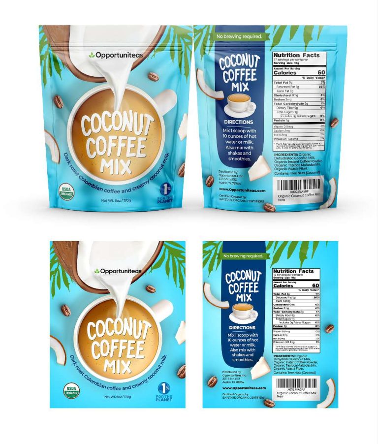
This project focused on crafting the packaging for Opportuniteas’ Coconut Coffee Mix, a unique blend of dark roast Colombian coffee and creamy coconut milk,…

  • Strategy

    The front of the packaging prominently displays the product’s name and highlights the coffee and coconut mix through clean, bold visuals. Clear, concise instructions and sustainability messaging are incorporated on the back, strengthening the product’s green ethos.

  • Design

    The package features a bold title with a simple logo for easy recognition. Coconut milk imagery and dark roast coffee beans highlight the fusion of ingredients. Clear instructions, nutrition facts, and sustainable messaging (1% for the planet) reflect the eco-conscious ethos. A modern, easy-to-read font conveys a healthy, convenient product with the tagline "No brewing required."

  • Client

    Opportuniteas

  • Outcome

    The final design successfully conveys the essence of the product, positioning it as a healthful, eco-friendly option in the competitive coffee market.

  • Tags

    BrandDesign, Coconut Coffee Mix, coffee, Coffee Mix, ConsumerAppeal, CreativePackaging, Custom Design, FMCG, Graphic Design, Grocery, PackageDesign, ProductPackaging, RetailDesign, Stand-Up Pouch

View Project

BeJay Bansi Rava

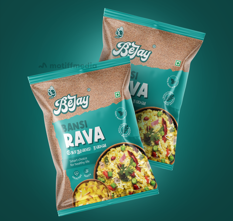
This project focused on designing the packaging for BeJay’s Bansi Rava, a premium and healthy food product. The objective was to create packaging that…

  • Strategy

    The design was centered around a modern, clean aesthetic that highlighted the natural, wholesome qualities of the product. The color scheme combined earthy tones with vibrant accents to enhance the product’s appeal, ensuring the packaging stood out on FMCG retail shelves.

  • Design

    The design uses a green and brown color palette to evoke freshness and natural qualities. The product name is prominently displayed, with clear icons indicating health benefits like "Healthy" and "Tasty." A traditional dish featuring Bansi Rava is shown on the packaging to emphasize its use in everyday cooking.

  • Client

    BeJay

  • Outcome

    The design successfully communicated the health benefits and versatility of Bansi Rava, contributing to increased product recognition and engagement from health-conscious consumers.

  • Tags

    Bansi Rava, BrandDesign, ConsumerAppeal, CreativePackaging, Custom Design, FMCG, Graphic Design, Grocery, PackageDesign, ProductPackaging, rava, RetailDesign

View Project

Zobina organic green tea

This project involved designing the packaging for Zobina’s organic green tea, which is mixed with organic orange peel to provide a natural and refreshing…

  • Strategy

    The design uses a rich green color to represent the freshness and natural qualities of the product. We ensured the packaging stands out on retail shelves by combining elegant design elements with clear messaging. The use of an orange slice and green tea leaves visually conveys the product’s ingredients, while the typography and layout emphasize the organic and vitamin-rich nature of the tea.

  • Design

    The packaging features a vibrant green backdrop with intricate patterns, signifying the organic, high-quality nature of the tea. The Zobina logo is prominently displayed, giving the brand identity a central role. The orange slice and green tea leaves are featured in a fresh, inviting way, drawing attention to the flavor and ingredients. The "100% Organic" and "Vitamin C" labels are clear and bold, ensuring the key benefits are immediately apparent.

  • Client

    Zobina

  • Outcome

    The packaging design successfully communicated the product’s organic nature and health benefits, helping it stand out in a competitive market. The fresh and premium design helped boost consumer interest and brand recognition.

  • Tags

    BrandDesign, ConsumerAppeal, CreativePackaging, Custom Design, FMCG, Graphic Design, Grocery, PackageDesign, ProductPackaging, RetailDesign, Tea, Tin Packaging

View Project

BeJay Barnyard Millet

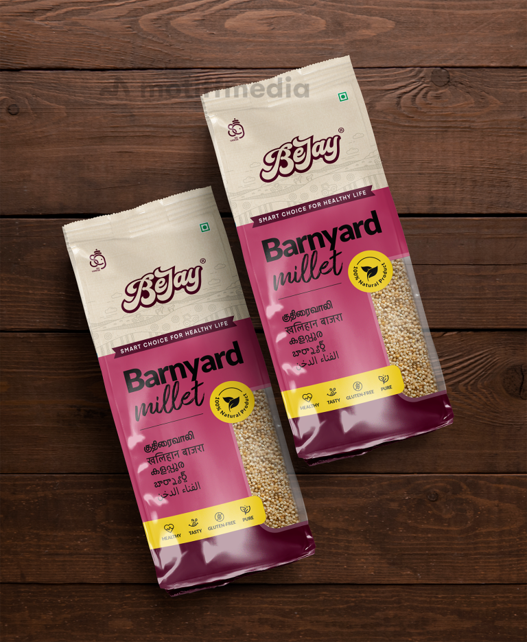
This project involved the creation of the package design for BeJay Barnyard Millet, a healthy and nutritious food product. The design aimed to communicate…

  • Strategy

    We incorporated a clean, modern design with a focus on clarity and trust, ensuring the packaging stood out on FMCG retail shelves. The use of a light, neutral color palette combined with vibrant accents drew attention to the product's key features: healthy, tasty, and gluten-free. The multilingual text added a local touch to appeal to the regional market.

  • Design

    The design features a distinctive burgundy and cream color combination, enhancing the visual appeal. The prominent "Barnyard Millet" text and icons signifying health benefits, such as "Gluten-Free" and "Pure," were placed strategically to catch the eye of the target audience.

  • Client

    BeJay

  • Outcome

    The packaging design successfully attracted the attention of health-conscious consumers, contributing to increased brand recognition and consumer trust in the product's quality.

  • Tags

    BrandDesign, ConsumerAppeal, CreativePackaging, Custom Design, FMCG, Graphic Design, Grocery, gusseted pouch, Millet, PackageDesign, ProductPackaging

View Project

Alfanoos Coffee Premium Natural Cloves

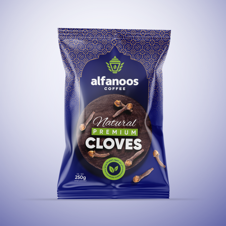
This project involved creating the packaging design for Alfanoos Coffee’s premium natural cloves. The goal was to design an elegant and authentic packaging that…

  • Strategy

    We adopted a minimal yet sophisticated approach, using a blend of clean typography, earthy tones, and a touch of modern design elements, ensuring the packaging stood out on FMCG retail shelves.  The use of natural imagery (cloves) and the inclusion of eco-friendly icons helped to highlight the product’s premium and organic nature.

  • Design

    The design features a rich purple background that contrasts well with the natural cloves and emphasizes the premium look. The sleek logo placement, along with the prominent 'Natural Premium' text, communicates the high-quality nature of the cloves. The eco-friendly emblem adds an authentic, sustainable touch to the packaging.

  • Client

    Alfanoos

  • Outcome

    The packaging design successfully captured the essence of the brand, appealing to the target market by emphasizing the product's quality and natural ingredients. It enhanced shelf presence and reinforced the premium positioning of Alfanoos Coffee.

  • Tags

    BrandDesign, Center-Sealed Package, Cloves, ConsumerAppeal, CreativePackaging, Custom Design, FMCG, Graphic Design, Grocery, PackageDesign, ProductPackaging, RetailDesign

View Project

Taj Mahal Original Pulses

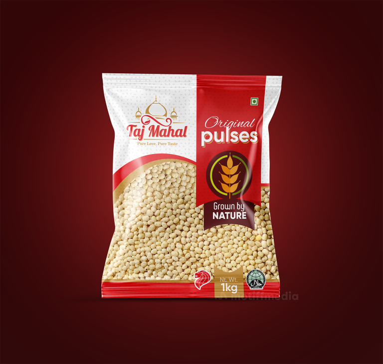
This project involved designing the packaging for Taj Mahal’s Original Pulses, aiming to create an attractive and premium package that communicates the natural, authentic…

  • Strategy

    The design incorporates a clean and vibrant color palette with the red and white scheme representing freshness and purity. We ensured the packaging stands out on FMCG retail shelves by using a modern font for the product name, "Original Pulses," while keeping the traditional elements intact with a strong focus on the "Grown by Nature" label. This approach emphasized the authenticity and quality of the product.

  • Design

    The design features bold typography with "Original Pulses" prominently displayed, and the "Grown by Nature" message is highlighted to convey the product’s natural origins. The Taj Mahal logo is featured at the top, reinforcing the brand's identity. The simple and clear design emphasizes the product’s premium nature, while the use of red and gold color accents adds a touch of luxury.

  • Client

    Taj Mahal

  • Outcome

    The packaging effectively highlighted the product's premium, natural quality, boosting consumer interest and reinforcing Taj Mahal's leadership in the pulses market. Its modern yet authentic design enhanced brand recognition on retail shelves.

  • Tags

    BrandDesign, Center-Sealed Package, ConsumerAppeal, CreativePackaging, Custom Design, FMCG, Graphic Design, Grocery, PackageDesign, ProductPackaging, Pulses, RetailDesign

View Project

Payir Premium Rice

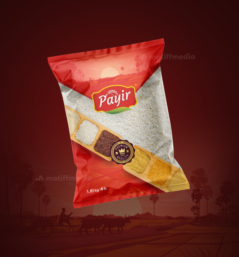
This project involved designing the packaging for Payir’s premium rice product. The aim was to create a packaging design that reflects the authenticity and…

  • Strategy

    The design uses a rich red background to evoke warmth and tradition, while the rice imagery is complemented by a landscape silhouette that reinforces the rural, authentic origins of the product. We ensured the packaging stands out on FMCG retail shelves by incorporating the “Premium” label and showcasing the rice's high quality. The clean design is aimed at modern consumers who are looking for authentic, high-end food products

  • Design

    The packaging features a bold red color with a picturesque sunset and rural landscape in the background, representing the natural origins of the rice. The front showcases a wooden tray with a variety of rice types, further emphasizing the quality and variety of the product. The Payir logo is prominently displayed, and the "100% Premium Quality" label highlights the rice's premium nature. The clean, modern layout and color scheme make the product both eye-catching and approachable.

  • Client

    Payir

  • Outcome

    The packaging design successfully communicated the rice’s premium quality and natural, traditional origins, helping it stand out on the retail shelves. The visual appeal and clear messaging contributed to an increase in consumer interest and brand recognition.

  • Tags

    BrandDesign, Center-Sealed Package, ConsumerAppeal, CreativePackaging, Custom Design, FMCG, Graphic Design, Grocery, PackageDesign, ProductPackaging, RetailDesign, Rice

View Project

Taj Mahal Dry Fruits & Nuts

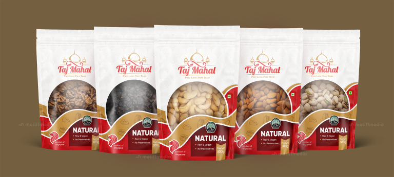
This project involved designing the packaging for Taj Mahal’s range of natural dry fruits and nuts, including walnuts, raisins, cashews, almonds, and pistachios. The…

  • Strategy

    The design incorporates elegant, clean elements with a traditional touch to convey the premium, authentic nature of the product. We ensured the packaging stands out on FMCG retail shelves by using bold, modern typography and a rich red and gold color scheme that evokes quality and luxury. The packaging design also communicates the raw, natural nature of the product through simple, clear language and icons.

  • Design

    The packaging features an elegant design with a soft, intricate pattern in the background, symbolizing the product's premium and natural attributes. The Taj Mahal logo is prominently displayed, conveying the brand’s authenticity and heritage. The "Natural" label is bold and clear, emphasizing the product’s key selling points, while the packaging material itself enhances the sense of premium quality.

  • Client

    Taj Mahal

  • Outcome

    The packaging design effectively communicated the natural, raw, and preservative-free qualities of the product, helping to position Taj Mahal as a premium choice for health-conscious consumers. The eye-catching design helped boost brand recognition and appeal in a competitive market.

  • Tags

    BrandDesign, ConsumerAppeal, CreativePackaging, Custom Design, Dry Fruits, FMCG, Graphic Design, Grocery, Nuts, PackageDesign, ProductPackaging, RetailDesign, Snacks, Stand-Up Pouch

View Project