Tuckker Detergent Powder

Tuckker Detergent Powder

Zobina Organic Persian tea

Zobina Organic Persian tea

Manschkin Rosalia Café Crème

Manschkin Rosalia Café Crème

Island Way Citrus Segments

Island Way Citrus Segments

Tuckker Detergent Powder

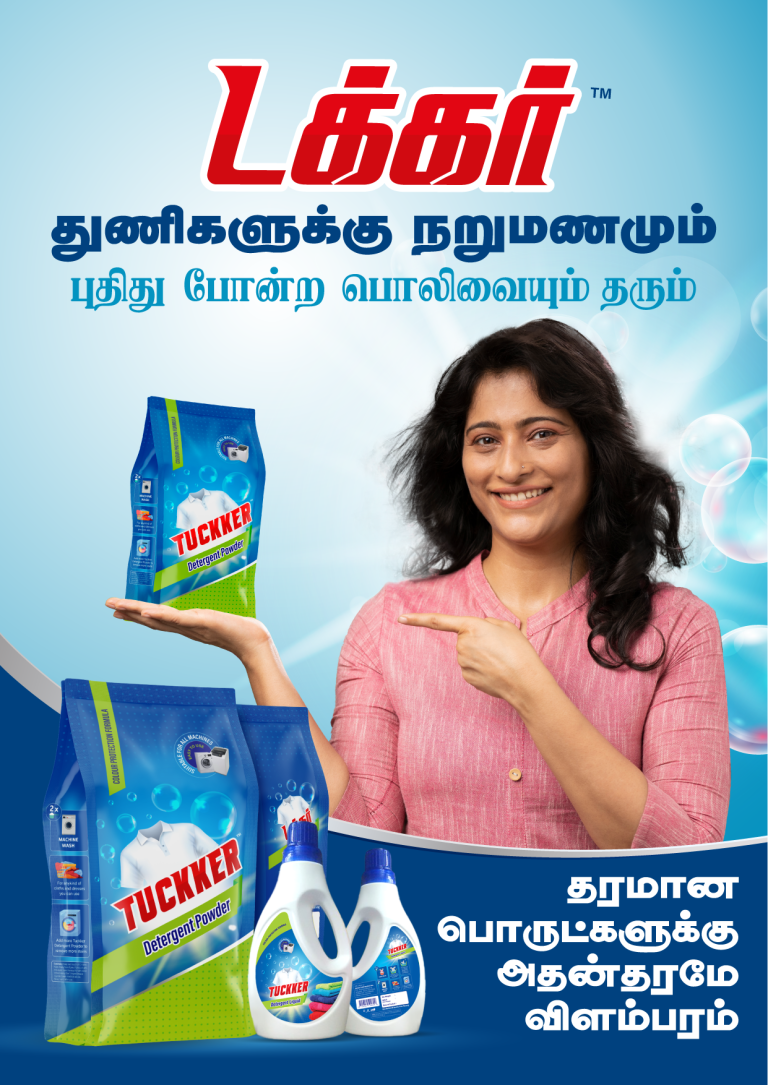
This project involved creating a promotional image for Tuckker Detergent Powder, highlighting its effectiveness for both machine and manual washing. The objective was to…

  • Strategy

    We ensured the packaging and product images stood out on FMCG retail shelves, utilizing bold colors and high-quality product shots. The design emphasized the product's versatility and effectiveness, while the model's gesture directed attention to the product.

  • Design

    The design incorporates a vibrant blue background that evokes cleanliness and freshness, with the product prominently displayed in the foreground. The packaging is clearly visible, showcasing the detergent powder and liquid variants. The model's pointing gesture adds a personal touch, creating an inviting and relatable tone for the audience. Text in Tamil appeals to the local demographic, ensuring cultural relevance.

  • Client

    Tuckker

  • Outcome

    The promotional image was effective in highlighting the versatility and cleaning power of Tuckker, contributing to a stronger brand presence and customer engagement. The clean, fresh visual created positive associations with the product.

  • Tags

    BrandDesign, ConsumerAppeal, CreativePackaging, Custom Design, Detergent Powder, FMCG, Graphic Design, Gusseted Package, PackageDesign, ProductPackaging, RetailDesign, WashingPowder

View Project

Zobina Organic Persian tea

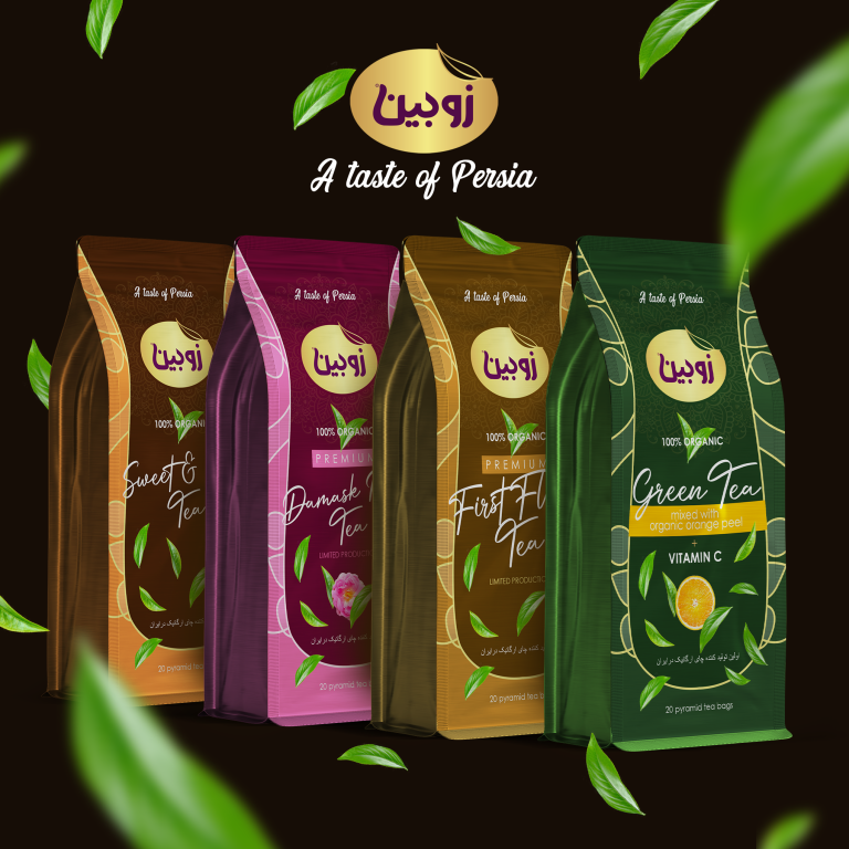
This project entailed designing the packaging for Zobina, a brand offering 100% organic Persian teas. The product lineup includes multiple tea variants such as…

  • Strategy

    The packaging was designed with vibrant colors corresponding to each flavor, allowing each variant to be clearly distinguished while maintaining a unified, premium look. The leaf motifs and elegant fonts communicate the organic and high-quality attributes. We ensured the packaging stands out on FMCG retail shelves with distinctive visual elements like rich colors and clean, refined typography.

  • Design

    The design features a combination of earthy tones and natural imagery, which highlights the organic nature of the product. Each variant—Sweet & Spicy, First Flush, and Green Tea with Orange Peel—is visually represented through unique, complementary color schemes. The iconic green leaves flowing across the design enhance the organic feel, while the luxurious gold foil details elevate the premium perception.

  • Client

    Zobina

  • Outcome

    The design successfully captured the essence of Persian heritage and organic purity, offering an elegant packaging solution that appeals to health-conscious consumers. The final product design has enhanced Zobina's brand recognition in the premium FMCG tea segment, contributing to increased customer engagement.

  • Tags

    BrandDesign, ConsumerAppeal, CreativePackaging, Custom Design, FMCG, Graphic Design, Grocery, Gusseted Package, PackageDesign, ProductPackaging, RetailDesign, Tea

View Project

Manschkin Rosalia Café Crème

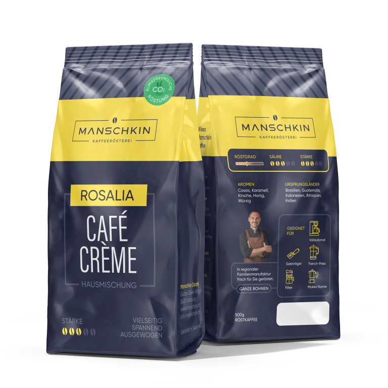
This project involved designing the packaging for Manschkin’s Rosalia Café Crème, a premium house blend coffee. The objective was to create a sophisticated and…

  • Strategy

    We focused on ensuring the packaging stands out on FMCG retail shelves, utilizing a bold and modern color scheme with yellow and navy tones to convey the premium nature of the product. We also incorporated a clear visual hierarchy to highlight important product features such as the flavor profile, origins, and brewing methods.

  • Design

    The design integrates sleek and modern elements, with the Manschkin logo prominently displayed at the top. The flavor descriptors and origin countries are clearly shown in a visually appealing way, with icons and images to guide the consumer. A CO2-friendly roasting symbol and information on the product’s strength and acidity further emphasized its quality.

  • Client

    Manschkin

  • Outcome

    The packaging design effectively communicated the premium nature of the coffee, leading to improved brand recognition and consumer interest. The modern, clean design contributed to the product’s positive reception on retail shelves.

  • Tags

    BrandDesign, Café Crème, coffee, ConsumerAppeal, CreativePackaging, Custom Design, FMCG, Graphic Design, Grocery, Gusseted Package, PackageDesign, ProductPackaging, RetailDesign

View Project

Island Way Citrus Segments

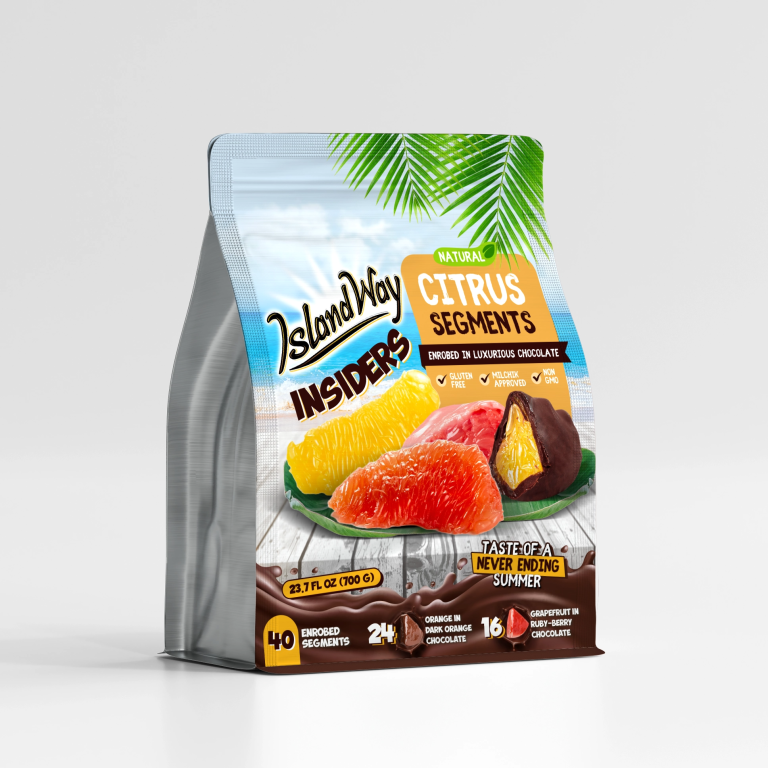
This project involved designing the packaging for Island Way’s Citrus Segments, a premium snack product featuring citrus fruits enrobed in luxurious chocolate. The objective…

  • Strategy

    The design was crafted to stand out on retail shelves with vibrant colors and tropical imagery. We combined bright citrus hues with luxurious chocolate tones to enhance its presence on FMCG shelves. The playful palm leaf graphic and beachy background evoke paradise and summer fun, reinforcing the product's exotic and indulgent experience.

  • Design

    The design uses a bold, tropical color palette, with orange and green accents reflecting the natural citrus elements. The "IslandWay Insiders" brand name is prominently displayed in a relaxed, fun font. The product's key benefits, such as being gluten-free, non-GMO, and milk and dark chocolate enrobed, are clearly highlighted. The image of citrus segments dipped in chocolate enhances the visual appeal.

  • Client

    Island Way

  • Outcome

    The packaging effectively conveyed the product’s tropical, fresh, and indulgent nature, boosting brand recognition and consumer appeal. Its vibrant, playful design made it stand out, attracting consumers seeking an exotic, guilt-free treat.

  • Tags

    BrandDesign, Chocolate, ConsumerAppeal, CreativePackaging, Custom Design, FMCG, Graphic Design, Gusseted Package, PackageDesign, ProductPackaging, RetailDesign, Snacks

View Project