This project involved designing the packaging for Paskesz Cracker Cuts Multigrain, a snack designed for consumers who are looking for healthy, simple, and wholesome…
Strategy
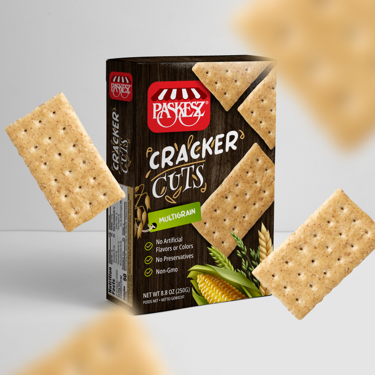
The design uses earthy tones, such as brown and green, to reflect the natural, wholesome qualities of the product. We ensured the packaging stands out on FMCG retail shelves by using large, clear typography for the product name and incorporating icons that emphasize key benefits like "No Artificial Flavors or Colors" and "Non-GMO."
Design
The packaging features a rustic, natural aesthetic with illustrations of wheat and corn to reinforce the multigrain nature of the product. The bold "Cracker Cuts" logo and the product name are placed prominently at the top, with "Multigrain" highlighted in green to catch the consumer's eye. The clean layout and natural imagery make the product feel both approachable and health-conscious.
Client
Paskesz
Outcome
The packaging design successfully conveyed the product's wholesome and healthy nature, contributing to increased consumer trust and interest. The bold, clean design helped the product stand out in a competitive snack market.