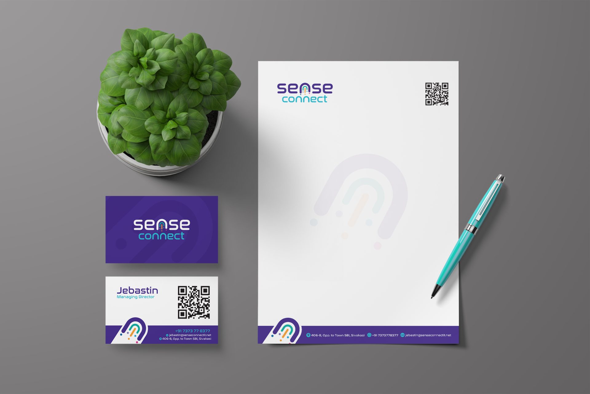
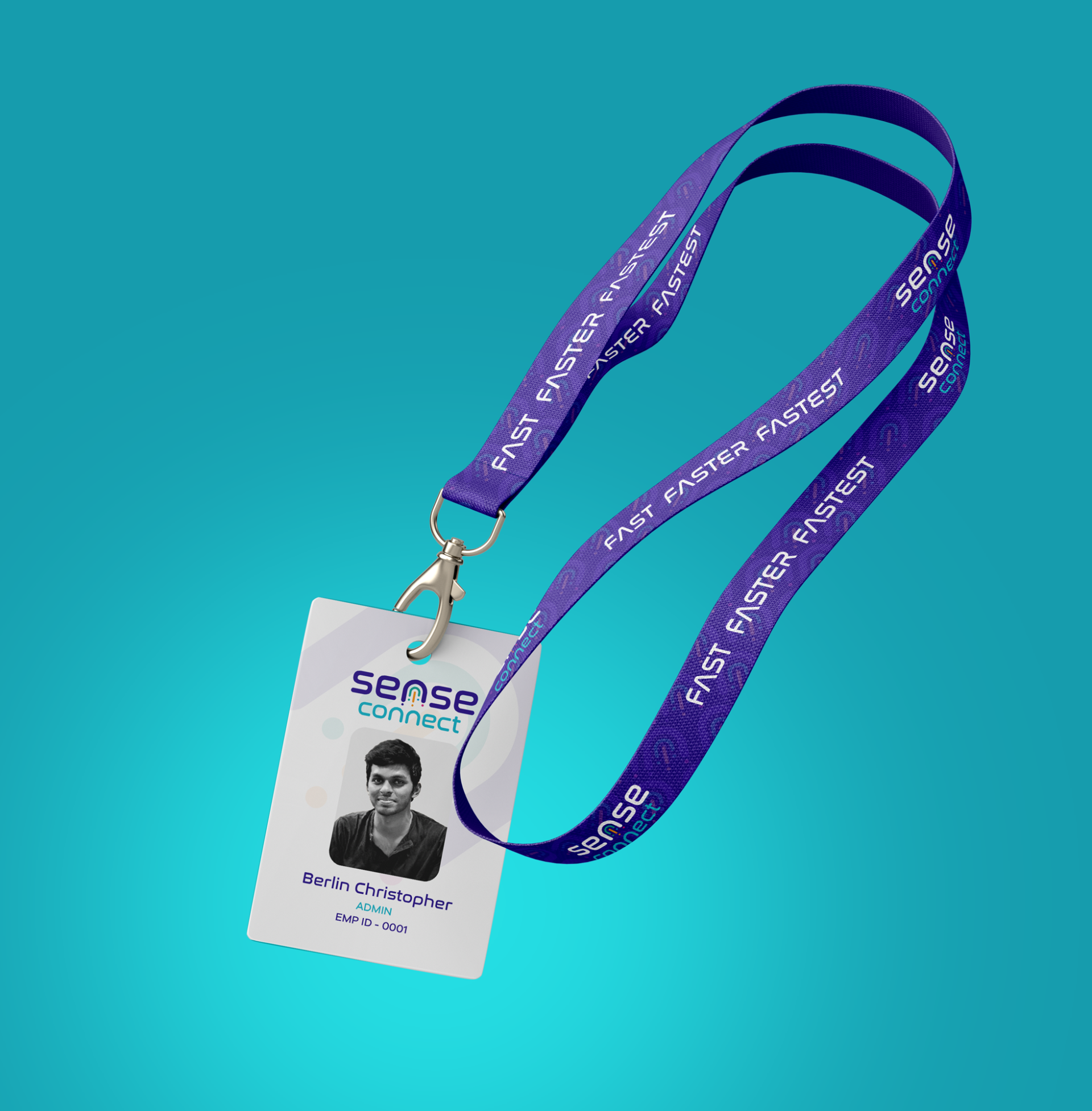
Sense Connect Rebranding

We’ve created a unique visual system and strategy across the wide existing spectrum of visible mobile applications and found yourself in a wide, straggling with wainscots.

Task

Redesign the outdated logo into a modern, trendy emblem that enhances brand recognition and communicates the company’s internet services.

Strategy

We recognized that the existing logo’s multicolored letters, cloud shape, and shadowy background failed to clearly convey the company’s internet services. Leveraging live feedback from the audience, we took on the challenge of creating a logo that truly reflects their mission.

Design

Our concept features a crashing comet symbolizing high-speed internet, with U-shaped layers representing the connection shared by families, companies, and organizations. The violet and blue hues add a touch of royalty, subtly highlighting the premium experience Sense Connect offers its customers.

Outcome

The reimagined logo now clearly communicates Sense Connect’s service and values, boosting brand recognition and customer engagement.

Client

Sense Connect

Back

Leave a Reply

Your email address will not be published. Required fields are marked *