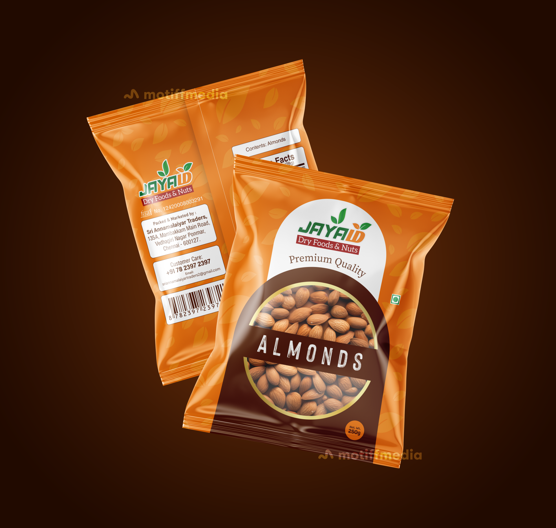
Jayaம் Almonds

This project involved designing the packaging for Jayaம்’s Almonds, a premium quality dry food product. The objective was to create a design that communicates the product’s high quality, freshness, and natural appeal, while standing out on retail shelves.

Task

The task was to design a packaging that highlights the premium quality of the almonds while making the product attractive to health-conscious consumers seeking quality dry foods and nuts.

Strategy

The design incorporates vibrant, earthy colors like orange to evoke a sense of freshness and natural quality. We ensured the packaging stands out on FMCG retail shelves by using large, bold fonts for the product name and creating a clear visual connection to the almonds through a close-up image on the front.

Design

The packaging features an orange color palette with leaf accents, which emphasizes the natural and fresh quality of the almonds. The "Premium Quality" text is prominently displayed to reinforce the high-end nature of the product. The logo of "Jayaம்" is clean and easily recognizable, with the product name “Almonds” centered in a bold font. The back of the package includes necessary product information in a clear layout.

Outcome

The packaging design successfully communicated the premium and natural qualities of the almonds, helping to enhance the brand’s identity and attract consumers. The clear and vibrant design made the product stand out in a competitive market.

Client

Jayaம்

Back

Leave a Reply

Your email address will not be published. Required fields are marked *