This project involved designing the packaging for Taj Mahal’s Original Pulses, aiming to create an attractive and premium package that communicates the natural, authentic…
Strategy
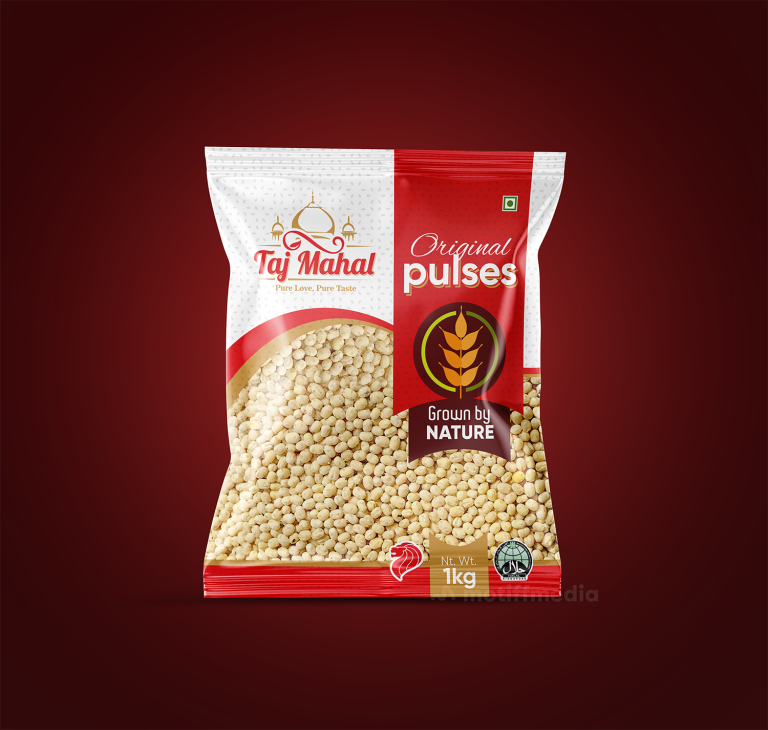
The design incorporates a clean and vibrant color palette with the red and white scheme representing freshness and purity. We ensured the packaging stands out on FMCG retail shelves by using a modern font for the product name, "Original Pulses," while keeping the traditional elements intact with a strong focus on the "Grown by Nature" label. This approach emphasized the authenticity and quality of the product.
Design
The design features bold typography with "Original Pulses" prominently displayed, and the "Grown by Nature" message is highlighted to convey the product’s natural origins. The Taj Mahal logo is featured at the top, reinforcing the brand's identity. The simple and clear design emphasizes the product’s premium nature, while the use of red and gold color accents adds a touch of luxury.
Client
Taj Mahal
Outcome
The packaging effectively highlighted the product's premium, natural quality, boosting consumer interest and reinforcing Taj Mahal's leadership in the pulses market. Its modern yet authentic design enhanced brand recognition on retail shelves.