Mini Mishkadiapers

Mini Mishkadiapers

Insta Relief Sleep-Aid

Insta Relief Sleep-Aid

Mini Mishkadiapers

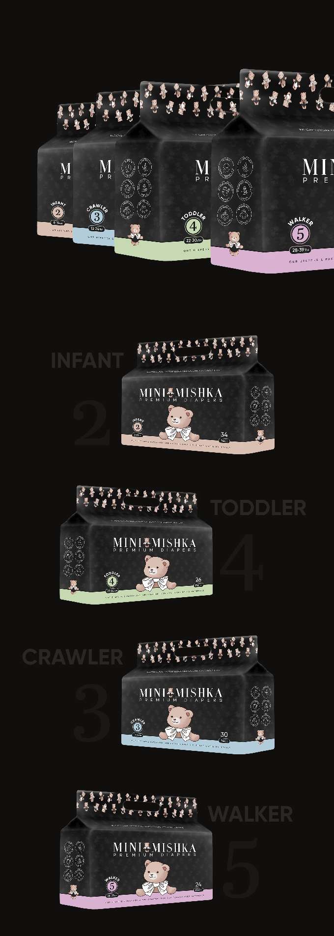
This project focuses on packaging design for a line of premium diapers branded Mini Mishka. The packaging targets parents and caregivers looking for reliable,…

  • Strategy

    We focused on designing packaging that not only communicates the premium quality of the diapers but also emphasizes comfort and care for babies. By including a playful bear mascot on the packaging, we aimed to create a friendly and trustworthy image for the brand. This ensures the packaging stands out in the FMCG retail shelves, especially in the diaper aisle, where clarity and trust are crucial.

  • Design

    The design includes vibrant color schemes tailored to each size, with a simple yet engaging bear mascot wearing a bowtie to add a cute touch. The typography is clean and easy to read, providing essential product information. The packaging also incorporates a convenient handle, enhancing usability.

  • Client

    Mini Mishka

  • Outcome

    The packaging has been well-received for its clarity, attractive design, and ease of use. It stands out on the shelves and helps parents make quick, informed decisions when purchasing baby products.

  • Tags

    BrandDesign, ConsumerAppeal, CreativePackaging, Custom Design, diapers, FMCG, Graphic Design, Guessted Pouch, PackageDesign, Personal Care, ProductPackaging, RetailDesign

View Project

Insta Relief Sleep-Aid

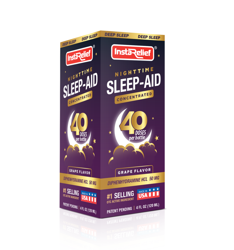
This project involved designing the packaging for InstaRelief’s Nighttime Sleep-Aid Concentrated formula. The client sought a visually compelling package for their sleep-aid product, which…

  • Strategy

    The design strategy was to use deep, calming colors to represent sleep and relaxation, such as rich purples and dark blues. The product's unique value propositions—concentrated formula, 40 doses per bottle, and active ingredient—were prominently displayed. We ensured the packaging stands out on FMCG retail shelves by using a mix of bold typography and soft imagery like clouds and a moon to communicate nighttime relief.

  • Design

    The packaging is structured with a clean, modern aesthetic, featuring bold branding and clear messaging. The use of stars, moon imagery, and a color palette that evokes night and calmness helped reinforce the product’s sleep-aid benefits. The inclusion of the number “40 doses” stands out, emphasizing the value per bottle. The grape flavor is clearly marked to appeal to customers seeking a pleasant taste.

  • Client

    InstaRelief

  • Outcome

    The final packaging design successfully communicated the product's core benefits in a visually appealing way. The design’s use of color and clarity helped the product stand out in the sleep aid section, appealing to customers seeking both effective relief and ease of use.

  • Tags

    BrandDesign, ConsumerAppeal, CreativePackaging, Custom Design, FMCG, Graphic Design, Mono carton packaging, PackageDesign, Personal Care, ProductPackaging, RetailDesign, Sleep-Aid

View Project