This project involved designing the packaging for Heritage Harvests’ range of Black Pepper Whole products. The goal was to create a design that communicates…
Strategy
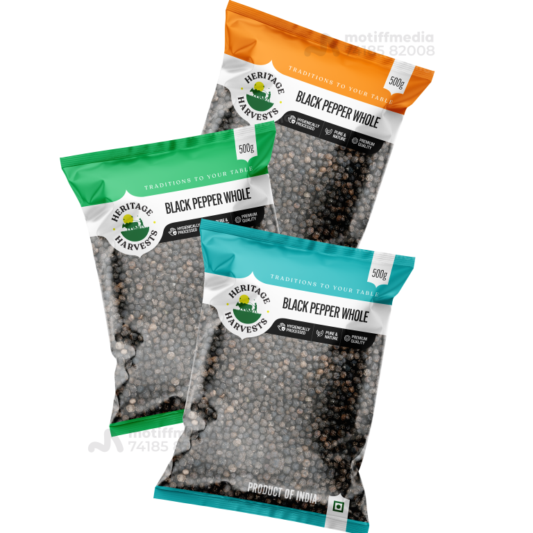
The design was created to stand out on FMCG retail shelves by using vibrant colors—green, orange, and blue—to differentiate between the different product variants. We made sure to clearly communicate the product's premium quality, natural processing, and the heritage behind it.
Design
Each packaging variant uses a different color for easy identification, while maintaining a clean and cohesive brand aesthetic. The logo, featuring the “Heritage Harvests” name and an image of greenery, reinforces the traditional, natural roots of the product. The text clearly highlights key selling points such as “Premium Quality” and “Naturally Processed.”
Client
Heritage Harvests
Outcome
The packaging design successfully conveyed the product’s premium quality and natural authenticity, leading to increased brand recognition and consumer engagement. The distinctive colors made it easier for consumers to identify the product on shelves.