ORS Blades & Fades Styling Cream

ORS Blades & Fades Styling Cream

Veridi BlendsVeridi Greens

Veridi BlendsVeridi Greens

Nature’s Nutrition Whey Protein

Nature’s Nutrition Whey Protein

Verdasa’s Heart & Immune Support supplement

Verdasa’s Heart & Immune Support supplement

Prowl Nutrition’s Creatine Gummies

Prowl Nutrition’s Creatine Gummies

ORS Blades & Fades Styling Cream

The project focuses on the design of a Blades & Fades Styling Cream packaging under the ORS brand. This product, formulated with olive oil,…

  • Strategy

    The design utilizes a blend of earthy tones like green to highlight the natural ingredients (olive oil, hops, aloe vera) and to convey a sense of quality and reliability. We aimed to give the packaging a masculine, yet approachable feel, making it suitable for both beard care and styling. The combination of clear typography and icons helps convey key benefits and product usage.

  • Design

    The packaging uses an elegant green color palette with subtle gradients and gold accents to make it stand out. A clear, easy-to-read font provides product information, while the icons representing the ingredients emphasize the natural and high-quality nature of the product. The sleek bottle design gives a premium look, perfect for retail.

  • Client

    ORS

  • Outcome

    The product's design is clean, professional, and appealing to the target audience. Its premium appearance and clear messaging are expected to drive attention and encourage purchase from consumers looking for high-quality beard styling solutions.

  • Tags

    BrandDesign, ConsumerAppeal, Cosmetic, CreativePackaging, Custom Design, FMCG, Graphic Design, Lable packaging, Oil, olive oil, PackageDesign, ProductPackaging, RetailDesign, Styling Cream

View Project

Veridi BlendsVeridi Greens

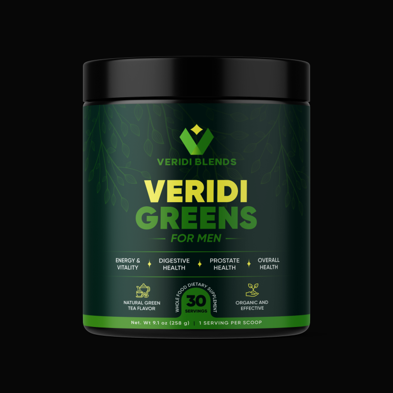
This project focused on designing the packaging for Veridi Blends’ Veridi Greens, a dietary supplement tailored for men’s health. The goal was to create…

  • Strategy

    We ensured the packaging stands out on FMCG retail shelves by using bold green tones that emphasize the natural, organic elements of the product. The design incorporates clean, modern typography and icons to communicate key health benefits such as energy, digestive health, and prostate health.

  • Design

    The design features a sleek, dark green background with a prominent product name "Veridi Greens" in bold yellow, making it instantly recognizable. The icons for different health benefits are strategically placed, along with a clear message about the natural green tea flavor and the organic composition of the product. The overall look is clean, fresh, and professional, aligning with the brand’s health-focused mission.

  • Client

    Veridi Blends

  • Outcome

    The packaging design successfully conveyed the product’s natural and health-oriented qualities, contributing to strong brand recognition and increased consumer interest in Veridi Greens.

  • Tags

    BrandDesign, ConsumerAppeal, CreativePackaging, Custom Design, DietarySupplement, FMCG, Graphic Design, Lable packaging, PackageDesign, ProductPackaging, RetailDesign, Supplement

View Project

Nature’s Nutrition Whey Protein

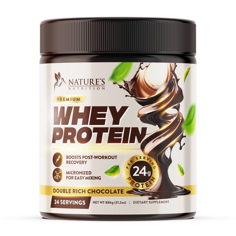
This project involved designing the packaging for Nature’s Nutrition Premium Whey Protein, a product aimed at fitness enthusiasts and individuals seeking post-workout recovery support.…

  • Strategy

    The design was developed to be bold, clean, and modern. We used a strong color palette with deep brown tones and gold accents to reflect the rich chocolate flavor and premium nature of the product. The protein content is clearly highlighted, along with key benefits like "Boosts Post-Workout Recovery" and "Micronized for Easy Mixing."

  • Design

    The packaging design uses modern typography and imagery, such as a swirling chocolate graphic, to visually communicate the flavor and texture of the protein. The prominent display of “24g per serving” and “Double Rich Chocolate” ensures the nutritional benefits are clear to the consumer. The "Nature's Nutrition" brand logo is cleanly placed at the top, reinforcing brand identity.

  • Client

    Nature's Nutrition

  • Outcome

    The packaging design successfully communicated the product’s premium nature and benefits, helping to position Nature's Nutrition Whey Protein as a trusted choice for post-workout recovery. The design's bold and professional look helped attract more consumers, boosting brand recognition and product sales.

  • Tags

    BrandDesign, ConsumerAppeal, CreativePackaging, Custom Design, DietarySupplement, FMCG, Graphic Design, Lable packaging, PackageDesign, ProductPackaging, Protein, RetailDesign

View Project

Verdasa’s Heart & Immune Support supplement

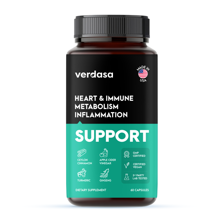
This project involved designing the packaging for Verdasa’s Heart & Immune Support supplement, which focuses on promoting heart health, immune function, metabolism, and reducing…

  • Strategy

    The design uses a clean, modern aesthetic with bold, contrasting colors (black and teal) to emphasize the product's premium nature. We ensured the packaging stands out on FMCG retail shelves by using a prominent "SUPPORT" label and icons that highlight the key features like "GMP Certified," "Vegan," and "Lab Tested."

  • Design

    The design features a minimalist layout with clear, easy-to-read text. The product name and key benefits ("Heart & Immune," "Metabolism," and "Inflammation") are prominently displayed at the top, while the ingredients and certifications are clearly presented in icons. The "Made in USA" badge is also featured to increase consumer trust.

  • Client

    Verdasa

  • Outcome

    The design effectively conveyed the product’s health benefits and premium quality, leading to increased brand recognition and consumer interest. The clean, professional look helped position Verdasa as a trusted brand in the health and wellness industry.

  • Tags

    BrandDesign, ConsumerAppeal, CreativePackaging, Custom Design, DietarySupplement, FMCG, Graphic Design, Lable packaging, PackageDesign, ProductPackaging, RetailDesign, Supplement

View Project

Prowl Nutrition’s Creatine Gummies

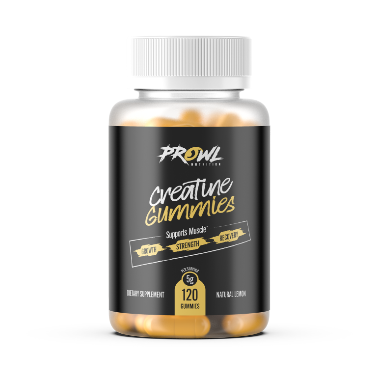
This project involved designing the packaging for Prowl Nutrition’s Creatine Gummies, a dietary supplement aimed at supporting muscle growth, strength, and recovery. The goal…

  • Strategy

    The design utilizes bold, clean colors with modern typography to give the product a strong and dynamic presence. We ensured the packaging stands out on FMCG retail shelves by incorporating high contrast black and gold colors that represent power, strength, and energy. Key benefits such as "Growth," "Strength," and "Recovery" are clearly highlighted to capture attention.

  • Design

    The packaging uses a sleek black background with metallic gold accents, giving it a premium look. The product name "Creatine Gummies" is in a bold, easy-to-read font, while the subtext clearly communicates its muscle benefits. The clean, minimalistic design ensures the focus remains on the product’s core benefits. The bottle's transparency shows the gummies inside, enhancing consumer trust.

  • Client

    Prowl Nutrition

  • Outcome

    The packaging design successfully communicated the product’s benefits in a clean and modern way, leading to increased brand visibility and consumer confidence. It helped position Prowl Nutrition as a go-to brand for fitness supplements.

  • Tags

    BrandDesign, ConsumerAppeal, CreativePackaging, Custom Design, DietarySupplement, FMCG, Graphic Design, Lable packaging, PackageDesign, ProductPackaging, RetailDesign, Supplement

View Project