This project involved designing the packaging for Manschkin’s Rosalia Café Crème, a premium house blend coffee. The objective was to create a sophisticated and…
Strategy
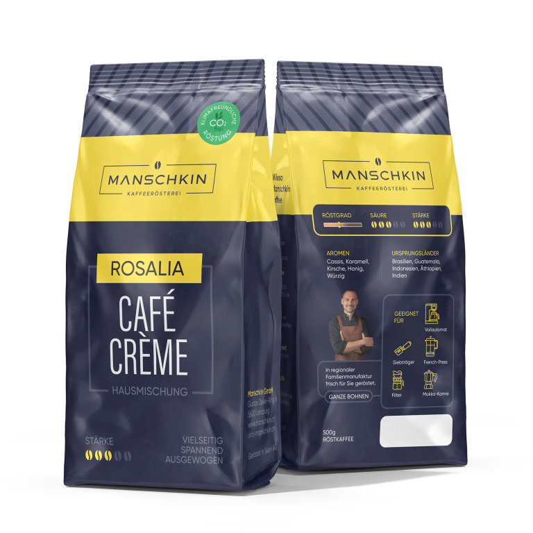
We focused on ensuring the packaging stands out on FMCG retail shelves, utilizing a bold and modern color scheme with yellow and navy tones to convey the premium nature of the product. We also incorporated a clear visual hierarchy to highlight important product features such as the flavor profile, origins, and brewing methods.
Design
The design integrates sleek and modern elements, with the Manschkin logo prominently displayed at the top. The flavor descriptors and origin countries are clearly shown in a visually appealing way, with icons and images to guide the consumer. A CO2-friendly roasting symbol and information on the product’s strength and acidity further emphasized its quality.
Client
Manschkin
Outcome
The packaging design effectively communicated the premium nature of the coffee, leading to improved brand recognition and consumer interest. The modern, clean design contributed to the product’s positive reception on retail shelves.