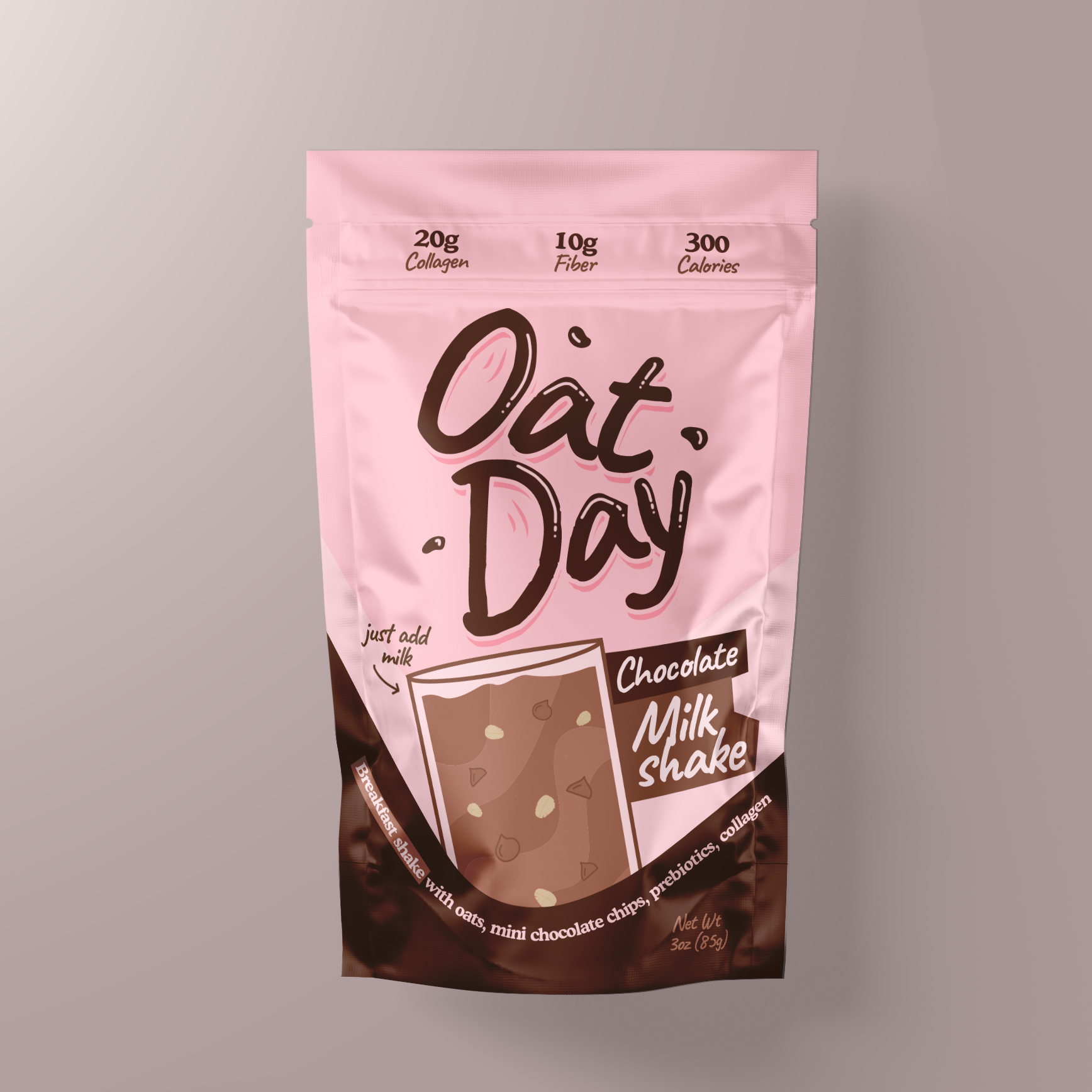
Oat Day Chocolate Milkshake

This project involved designing the packaging for Oat Day’s Chocolate Milkshake, a nutritious and convenient shake mix that combines oats, mini chocolate chips, prebiotics, and collagen. The goal was to create a packaging design that conveys the product’s delicious taste and health benefits while appealing to a broad audience.

Task

The task was to develop a fun, vibrant design that communicates the product's main benefits, such as its high collagen and fiber content, while highlighting the indulgent chocolate flavor. The design had to be eye-catching on retail shelves and encourage consumers to try the product.

Strategy

We ensured the packaging stands out on FMCG retail shelves by using a bright and playful color palette with pink and brown tones to evoke both energy and indulgence. The typography is bold and friendly, making the product feel approachable. The key health benefits are displayed clearly at the top of the packaging, while the playful illustrations highlight the chocolate flavor and oats.

Design

The design features a clean, modern layout with vibrant colors and whimsical illustrations of chocolate and oats. The bold "Oat Day" logo draws attention, and the product name “Chocolate Milkshake” is easily readable. The health benefits, like 20g of collagen and 10g of fiber, are clearly displayed at the top, creating a balance between indulgence and nutritional value.

Outcome

The packaging design effectively captured the fun and nutritious nature of the product, leading to increased brand recognition and consumer interest. Its vibrant and approachable design helped make the product stand out on the shelves.

Client

Oat Day

Back

Leave a Reply

Your email address will not be published. Required fields are marked *