Amoodi’s Ice Cream

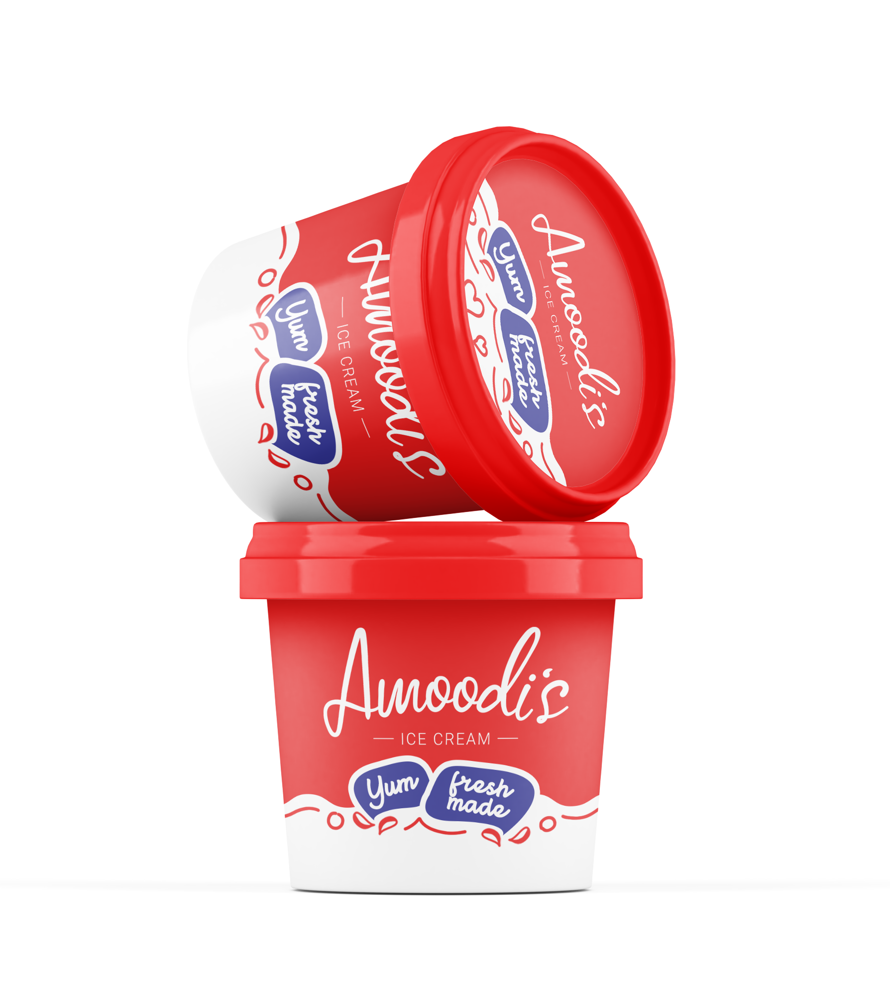
This project focused on designing the packaging for Amoodi’s Ice Cream, a brand that emphasizes fresh, delicious flavors. The goal was to create a fun, inviting design that communicates the product’s quality and freshness.

Task

The task was to develop packaging that would appeal to ice cream lovers, highlighting the brand’s promise of fresh, tasty ice cream while making it visually appealing on retail shelves.

Strategy

The packaging was designed with bold, vibrant colors and a playful, fun aesthetic to stand out on FMCG retail shelves. The use of bright red and white not only makes the packaging eye-catching but also conveys a sense of freshness. The messaging clearly emphasizes "Yum" and "Fresh Made" to reinforce the quality of the product.

Design

The design features a clean, modern layout with the product name "Amoodi’s" in a friendly, playful font. The use of a simple red and white color scheme, with playful milk drop motifs, makes the packaging feel fresh and approachable. The inclusion of "Yum" and "Fresh Made" prominently highlights the brand’s commitment to quality and freshness.

Outcome

The packaging design successfully conveyed the fresh, fun nature of the ice cream, attracting consumers and creating a strong brand presence on shelves. Its simplicity and clarity helped reinforce the product's appeal to a broad audience.

Client

Amoodi

Back

Leave a Reply

Your email address will not be published. Required fields are marked *