This project focused on designing the packaging for Rojaa Mark’s Peanut Chikki, a traditional Indian sweet made from peanuts and jaggery. The objective was…
Strategy
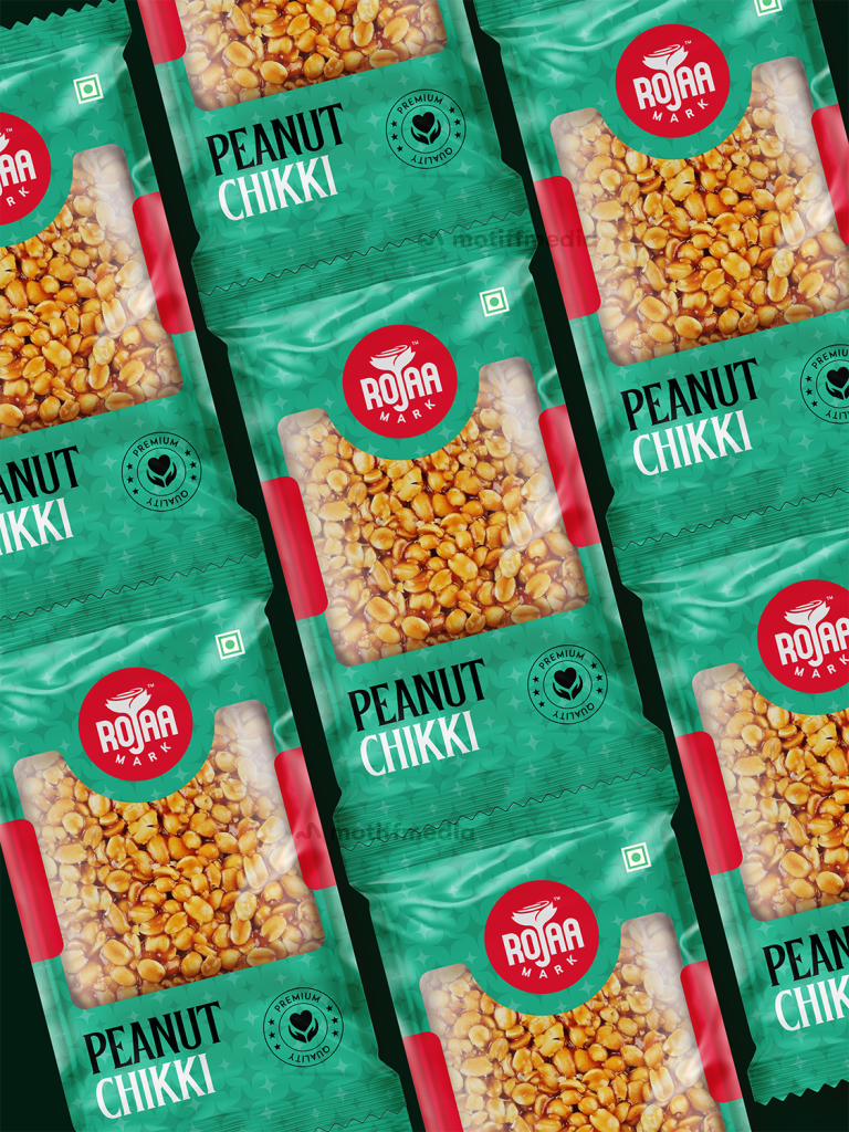
The design strategy involved using bold colors to make the product stand out in the FMCG market. Green, a color associated with freshness and natural products, was chosen to represent the chikki's authenticity. The packaging was designed to communicate the product's premium quality with a clean, modern layout, incorporating clear text and a friendly, recognizable logo.
Design
The packaging features a prominent display of the product name, "Peanut Chikki," with a bold red logo that adds a sense of familiarity and trust. The background uses a fresh green color to emphasize the product’s natural and high-quality ingredients. The "Premium Quality" tag in a circular format reinforces the product's superior nature, making it more appealing to health-conscious consumers.
Client
Rojaa Mark
Outcome
The packaging design successfully communicated the premium quality of the Peanut Chikki while staying true to its traditional roots. The use of bold colors and modern typography helped the product stand out on retail shelves, contributing to increased consumer interest and brand recognition.