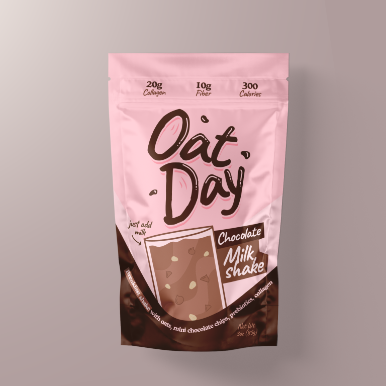
This project involved designing the packaging for Oat Day’s Chocolate Milkshake, a nutritious and convenient shake mix that combines oats, mini chocolate chips, prebiotics,…
Strategy
We ensured the packaging stands out on FMCG retail shelves by using a bright and playful color palette with pink and brown tones to evoke both energy and indulgence. The typography is bold and friendly, making the product feel approachable. The key health benefits are displayed clearly at the top of the packaging, while the playful illustrations highlight the chocolate flavor and oats.
Design
The design features a clean, modern layout with vibrant colors and whimsical illustrations of chocolate and oats. The bold "Oat Day" logo draws attention, and the product name “Chocolate Milkshake” is easily readable. The health benefits, like 20g of collagen and 10g of fiber, are clearly displayed at the top, creating a balance between indulgence and nutritional value.
Client
Oat Day
Outcome
The packaging design effectively captured the fun and nutritious nature of the product, leading to increased brand recognition and consumer interest. Its vibrant and approachable design helped make the product stand out on the shelves.