Cresco Spirulina Millet Cookies

Cresco Spirulina Millet Cookies

Milletify’s Finger Millet Cookies

Milletify’s Finger Millet Cookies

Cresco Spirulina Millet Cookies

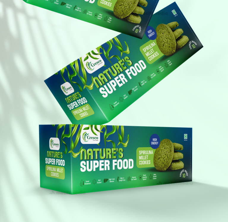
This project involved creating the packaging design for Cresco’s Spirulina Millet Cookies, branded under the tagline “Nature’s Super Food.” The design had to reflect…

  • Strategy

    The design integrates vibrant greens to represent the healthy, natural ingredients of spirulina and millet. We ensured the packaging stands out on FMCG retail shelves through clean, bold typography and high-energy imagery, using a layout that emphasized both the superfood aspect and the snack’s energizing qualities. The packaging communicates both vitality and natural goodness, essential for this health-focused product.

  • Design

    The design highlights the product’s green spirulina color, reinforcing its superfood credentials. It uses organic elements, such as the subtle illustration of millet stalks, to add to the visual appeal and emphasize the natural ingredients. The product’s benefits, such as "High Energy" and "Lower Cholesterol," are clearly highlighted to capture the attention of health-conscious consumers.

  • Client

    Cresco

  • Outcome

    The final packaging successfully conveys the health and energy benefits of the product while ensuring it catches the eye on store shelves. It enhanced Cresco’s brand positioning in the competitive FMCG snack market by promoting health-conscious choices in a visually appealing way.

  • Tags

    BrandDesign, ConsumerAppeal, Cookies, CreativePackaging, Custom Design, FMCG, Graphic Design, Millet, Millet Cookies, Mono carton packaging, PackageDesign, ProductPackaging, RetailDesign, Snacks

View Project

Milletify’s Finger Millet Cookies

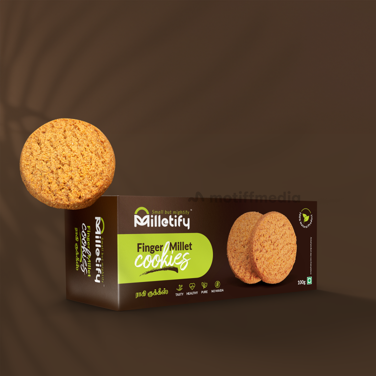
This project focused on creating the packaging design for Milletify’s Finger Millet Cookies, a healthy snack option made with nutritious finger millet. The objective…

  • Strategy

    The packaging was designed to stand out on retail shelves with a vibrant green accent, which emphasizes the natural and healthy aspects of the product. The clean typography and clear messaging, such as "Tasty," "Healthy," and "Pure," are used to reinforce the product’s benefits. The playful yet simple design with a cookie visual helps to immediately communicate the product type.

  • Design

    The design uses earthy tones of brown and green, which align with the natural, healthy qualities of the product. The prominent "Finger Millet Cookies" text makes the product easy to identify, while the playful "Small but Mighty" tagline emphasizes the strength of millet. Icons representing key features like "No Maida," "Tasty," and "Healthy" are included for added clarity.

  • Client

    Milletify

  • Outcome

    The design successfully communicated the health-focused nature of the cookies while appealing to consumers who prioritize both taste and nutrition. The bright, clean design helped the product stand out on shelves, contributing to increased brand awareness.

  • Tags

    BrandDesign, ConsumerAppeal, Cookies, CreativePackaging, Custom Design, FMCG, Graphic Design, Millet, Millet Cookies, Mono carton packaging, PackageDesign, ProductPackaging, RetailDesign, Snacks

View Project